RIP, Gorgeous. I'm late, but I had to post some photos. If you guys haven't seen Cat on a Hot Tin Roof (my favorite of Paul Newman's...), do it, do it!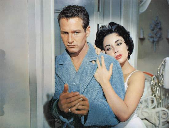 Brick and Maggie
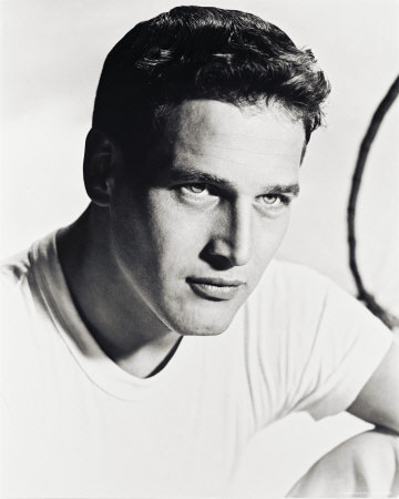 That face!
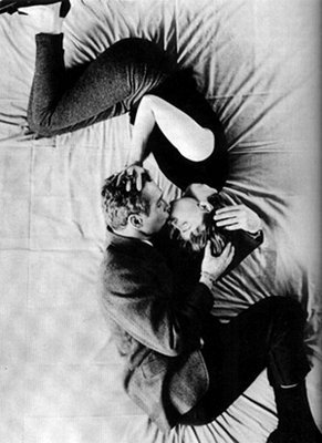 Paul + Joanne
PS-Some of you might have nominated Violet on the Runway for a Cybil, which is so, so nice! But I'm afraid it doesn't qualify because it's a 2007 book. Violet by Design and Violet in Private were both 2008 though! Also, I bought A Crooked Kind of Perfect (one of the 2007 winners) yesterday at a book fair. It looks so good.
Other Stuff
Nominate your favorite '08 book for a Cybil!
First, I have to say this: I loved Nick and Norah! Michael Cera was fantastic, obviously, and so was Kat Dennings! David and Rachel--the authors--were so excited and giddy (spot them in the Veselka diner scene--they're the couple eating behind N&N). You can read what both of them think about the movie here and here. Oh, and the soundtrack was phenomenal. Bishop Allen especially rocked. Okay, gushing over. Go see it! PS-I saw James Franco at a bar after the movie. GOOD NIGHT.Okay, now on to the real purpose of this post. Do you guys know about the Cybils? Here's a little explanation, from the horse's mouth:
"We wanted a literary competition that combined the freewheeling democracy of the Internet with the thoughtfulness of a book club. Cybils lets the public nominate books here on our Cybils blog, but then bloggers team up to pick the finalists and winners. The winning books must combine quality and 'kid appeal.'"
Here's where you can nominate books for the Young Adult category (just leave your book nomination in the comments--one title per person!). There are a bunch of categories, so look through the blog to find more if you want to name more than one title.
Go nominate a book from 2008. It'll be fun. Also, see the widget for last year's winners! (Confession: I've only read one of these--Shannon Hale's Book of a Thousand Days... what about you guys?)
Photo Friday: Asheville and Nick & Norah!!
I've been meaning to post photos from my trip to Asheville, NC, and here are a few. The Biltmore is incredible (as was my friend Shay's wedding on the grounds), and the town of Asheville is such a cool spot. Even my New Yorker boyfriend had to admit that it ruled. Plus, I got to meet Violet fans Flinn and Jocelyn (of Teen Book Review fame) at Malaprops, an incredible indie bookstore. Thanks, guys!


 Now, tonight I'm going to see Nick and Norah's Infinite Playlist! FINALLY. And, awesomely, I'll be seeing it with authors David Levithan and Rachel Cohn. I am so not worthy! And I can't wait. Here's my local subway station's N&N poster, which is kind of the coolest thing ever. When one of my books has a subway poster, I will feel quite queenly.
 So, are you guys going to see it this weekend or what? Let me know what you think if you do!
Violet Contest Entry: Dominique
Just a big thank you to another person who entered the contest, Dominique of The Book Vault fame! She designed a banner for all three books and then individual bookmarks for each title. They all have a dreamy feeling to them, I think. Thanks, Dominique!


 What do you guys think? Should I put these into production for the next set of bookmarks?!
Win-It Wednesday: Living Dead Girl and Do-Gooder Impulses
Did you guys read everyone's who-I-met stories? I loved them! Thanks for sharing all of those. New people make life less boring. The winner of the signed copy of Specials is... The Bookworm! Send me your address, BW. This week, I'm giving away a copy of Living Dead Girl by Elizabeth Scott. I finished this book in a few hours; I really couldn't turn away from it. While I've really enjoyed all of Elizabeth Scott's books that I've read, this one is very different from her other works. It's dark and harrowing and relentless in its emotional pitch--it totally would have scared me if I'd read it at a younger age (and I still slept with the lights on one night after I read it, but I'm a freak like that).
In an ALAN interview, Elizabeth Scott put into words why this book feels like so much more than a voyeuristic portrayal of abuse: "I think it's easy to get outraged over a child's abduction, but it's also equally easy for us to see something--someone--that makes us uncomfortable, a moment or an expression that give us pause, and to do nothing. And that moment where we see and turn away is, I think, the heart of Living Dead Girl. Alice's story isn't just about what she endures with Ray. It's what she endures at the hands of the world. How it doesn't see her."
This book will knock you on your butt. It's an important one.
So, on the note of not seeing things happening in the world, I'm going to post this vlog I made for Devyn Burton's Book Transfusion project (I have no idea why it freezes with my eyes closed--dumb!). Watch it, and then tell me, What's your good deed this week?
It can be a donation to The Book Transfusion (contact Devyn here), some extra time spent with your grandmother, a smile for a stranger who looks down--anything! But tell me how you're spreading the love this week, and how you're really seeing the world. I'll choose a winner next Wednesday, and I'll throw in some lip gloss from TESS, too, just to lighten the spirit of the package. Lip gloss is key.
PS-It's Banned Book Week and Maureen Johnson says this better than I could, so check her out!
Cover Stories: The Death by... series, by Linda Gerber
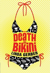
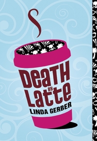
Linda Gerber's books are full of action and romance--I loved Death by Bikini (as noted here) and can't wait to read my new copy of Death by Latte. Death by Denim comes out in February.Now, as I've said repeatedly, I love holes in book covers. Seriously. LOVE. So this week's Cover Story with Linda is extra special, because she's got holes in her covers, and I had to find out how that happened.
 Did you have an idea in mind for your cover as you were proposing/writing the book? If so, what did it look like?
"For the first book, I had envisioned a kind of tropical, beachy theme, but hadn't thought much more specifically than that. For the other books - after seeing what had been done with DEATH BY BIKINI - which I loved - I just sat back and anticipated the surprise!
"When I first saw the DEATH BY BIKINI cover, I literally bounced out of my chair with excitement. I couldn't believe that I had scored such an awesome design and a die-cut, step-back cover. (MW note: Yes! Die cuts rule!) And when Puffin sent me some mock-ups, I turned into one of those proud new-parent types, whipping out my killer cover to show off to anyone who wandered within bragging range!"
Did your editor let you make comments/suggestions on the cover, if you wanted to?
 "Yes. Each time, I received a jpeg of the preliminary cover and was asked for suggestions. I'm ashamed to say that with the DEATH BY DENIM cover, I wondered if perhaps the skirt image should be a little scruffier. Then I got the mock-up of that one and in "real life" with the die-cut pockets, I knew immediately that my scruffy vision wouldn't have looked half as fabulous. I'm glad to say that although the designers listened to my concerns and addressed them politely, they stuck to the original version - and it rocks!"
How do you feel about your cover, in the end?
"I am in love with, and am very proud of each one of the covers in this series!"
Linda also talked to her cover designer, Theresa Evangelista, who added to Linda's cover story:
"The Death by covers are the result of a great collaborative effort between our publisher, editor and design team. There was a lot of in-house excitement about the series and we knew we wanted a bold and graphic package that would stand out on bookshelves. So early on, we got the go ahead to think about using special production effects on the cover (eg. metallic printing, special inks, embossing... etc.). My art director suggested die-cutting and Angelle referenced the ubiquitous iPod print ads (dancing black sillos) to illustrate the edgy, yet fun tone she envisioned. We also knew the clever title(s) should be front and center since they could act as a consistent branding tool for the series.
"I went to mock up some concepts for Bikini with these in mind. The beach setting and murder mystery plot conjured up images of old James Bond movies and pulp fiction novels, so this inspired the retro primary color scheme and halftone sunburst in the background.
Share the Red
Share this widget! I've talked about RED before, and I really can't stop raving about the girls who wrote essays in this book (some of whom read this very blog!). So, now, RED is almost out in paperback (yay!). To help count down, post this widget to your various pages, email it to a friend, link to it in a blog entry--however you want to share the RED. Also: Buy the paperback. So worth it. If you doubt me, check out the girls reading essays on RED's site, read their stories in the LA Times and interviews in the Boston Globe and on the Huffington Post... these girls rule.
Photo Friday: Dad
More Violet Contest Entries I Loved!
Cover Story + Win-It Wednesday: Specials by Scott Westerfeld
The winner of last week's copy of the signed copy of Someone Like You by Sarah Dessen is... Cyndi! And the winner of the TESS skincare kit is... Paradox! Email me your addresses so I can send out your prizes. And thanks, everyone, for the youtube links. I got no work done last week, so, mission accomplished! This week, however, I have a new book idea that my agent is into and I'm psyched. Now, because of my political interlude on Monday, I neglected the Cover Story for this week. I therefore have a brief "cover story" to share about Scott Westerfeld's Specials! This one involves me telling the story, because I just so happened to be at a friend's barbecue in Brooklyn this summer where I saw an acquaintance named Katerena Alkhimova, whom I knew was a model. We started talking about how she saw her photo on the cover of a YA book recently, and I was intrigued!
"Which one?" I asked.
"A science fiction one," she said.
"What was it called?!" I asked.
"It had a one-word title," she said. "And they put tattoos on my face."
I had just finished Uglies and Pretties, the first two books in the four-book Uglies "trilogy," so I knew it was Specials! Then I made her turn her head and I could just see the cover. It was so cool! Here's what Katerena, who's originally from Russia, says: "The shoot was very easy and fast. We only had to do that one picture which did not take even two hours to make. It was three years ago though, so it is hard to remember particular details." I got to tell her that her character is both painfully gorgeous and devastatingly evil. I think she liked that.
When I saw Scott Westerfeld later, I asked him if he'd mine me posting this story, and he graciously said that would be fine. I just wish I'd snapped a photo of bbq Katerena, but here are some other shots of her so you can see what she looks like in non-science-fiction situations (two modeling shots and one casual):


 So that's that. And don't you want to win my autographed copy of this book?! Full disclosure: I haven't read the whole thing yet, but I've read Uglies and Pretties, and it's a great series, so I feel confident recommending Specials, and I can't wait to read it.
How do you enter? Tell me about someone cool you met recently. Could be an unexpected new friend, a fascinating co-worker or someone who's been on a book cover. Haha! I really love meeting people and hearing their stories--and everyone has something interesting to share.
Can't wait to hear your comments.
PS-Win a copy of Violet on the Runway at author Carmen Rodrigues's blog!
PPS-Elizabeth Scott always has great contests, and I love the question she asks this week, so go enter to win books there too!
 Also: Buy the paperback. So worth it. If you doubt me, check out the girls reading essays on