Diana Rodriguez Wallach has a series that comes out faster than you can read them--so much fun! She's also always shelved near me at the bookstore, and I'm drawn to her pretty covers. Here's the story behind their creation: "I was actually able to offer a lot of input before the art department got going on the cover of Amor and Summer Secrets, the first book in my young adult series. After I signed with Kensington, I went up to Manhattan to have lunch with my editor, Kate Duffy, and she was nice enough to bring along the art director who'd be designing my cover. This gave me the opportunity to describe how I envisioned the cover directly to the source and after the meeting, we all went to Barnes & Noble to look at some examples on the YA shelves.
"The following covers are not necessarily inspiration in that I don't think the models look anything like Mariana, but they're covers I remember pointing out during that Barnes & Noble visit. I felt either each captured the mood of Amor and Summer Secrets, or the image jumped out at me from the shelf.

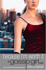
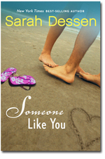 "Mainly for Amor and Summer Secrets, I wanted to feature a photograph on the cover, something moody. My character, Mariana, is very introspective and I wanted an image that would reflect that. I also wanted to feature a model who was not a stereotypical Latina, as Mariana has red hair and freckles in the book.
"For the third book in the series, Adios to All The Drama (which just debuted this month), we kept with the theme of showcasing a picture behind 'holes.' (I don't know if there's a better graphic design term for the look.) I really like the theme.
 "The Adios cover showcases the wedding that occurs at the end of the book where Mariana and Lilly are bridesmaids. The biggest change that was made as a result of the cover is that the bridesmaid dress pictured is Tiffany blue, whereas the dress in the book was originally silver. I could have left the color scheme as silver, but ultimately I decided to change to it to robin's egg blue so it would be consistent with the cover. I think as a reader, it bugs me when things like that don't match.
"I'm pretty sure they used a stock photos, which is why each cover features a different model. Personally, I love the model on Amor and Summer Secrets and she's really come to look like Mariana to me. So I would have preferred to see her used on all three books. But in the end, I'm happy with how all three turned out. I think the concept is cohesive and very eye catching.
"My editor was also thrilled that they were able to include a 'tip in,' which is the full color photo of the model directly behind the outside cover. I think it's more expensive to do this, but she thought it was important to showcase the full image and I was really excited that they did. All three books feature a tip-in cover.
 "The biggest change they made to the original covers was Mariana's hair color. The models on both the Amor and Summer Secrets cover and its sequel Amigas and School Scandals do not have naturally red hair. But the art director changed the hue to auburn to better match the book. This was a very important change for me, because Mariana is depicted as not physically resembling the stereotypical Latina , and her hair color is a major component of that."
"When I first saw Amor and Summer Secrets, I started freaking out in my living room. This is my first book and there was my name on the cover. It was amazing and to this day, the Amor and Summer Secrets cover is the background image on my laptop."
Cool! What do you guys think? I agree with the dress color change--as a reader I really dislike when covers don't match the stories. Good move, Diana. I think the holes brand the series really well, and I love how Mariana has such a distinct look!
Other Stuff
Win-It Wednesday: Revolutionary Road by Richard Yates
It was so fun to hear about where everyone was during the inauguration. Some watching, some studying, some totally ignoring. All interesting! The two winners from last week, as chosen randomly, are... HI im Kaitlyn *waves frantically* (The ABC's of Kissing Boys) and Ann (the necklace)! Send me your addresses. This week, I went and saw Kate and Leo in their first movie together since Titanic (which I saw a total of five times in the theater, but remember that I worked there so the screenings were free... and that makes it a little less embarrassing). Now, I've blogged about Revolutionary Road before, and the movie people offered a book for Win-It Wednesday this week! So, here's your chance.
The thing is, I loved the movie, but having read the book and knowing even more of the back story made it that much better. Richard Yates's novel is a total masterpiece. It's about a married couple in the suburbs--so it's not quite what I normally feature here--but it's definitely worth reading. I'd be interested to hear what you guys think. So whoever wins it has to report back!
To enter to win, just comment below and tell me what non-Young Adult book you've liked lately, if you've read one. I read so much YA that I joined a book club just so I'd have to read a regular fiction book every once in a while, and that's how I found Revolutionary Road.
Good luck!
PS-Other contests to know about (leave more in the comments if you've got em!):
1. This one on Linda Gerber's blog (ends 2/1).
2. This one on I Heart Daily (ends 2/10).
3. This one at readergirlz, including 25 full sets of Ellen Emerson White's President's Daughter series (ends 1/31).
Cover Stories: Take the Reins by Jessica Burkhart
Jessica Burkhart is one of the most productive and pro-active authors I know, and her first book just came out! She does a great series on her blog about being a first-time author, and she's just a fun and fabulous person in general. So I had her come talk about her debut cover for Take the Reins, book one in the Canterwood Crest series, and it turned into a mutual lovefest. Yay!Here's Jess:



 Take the Reins officially goes on sale tomorrow, but I hear there are copies out now. Congratulations on the release, Jess!
Saturday Link Love


 Just a few places to visit today:
 1. My friend Erin went on my first wedding-dress-shopping trip with me, and she blogged about it for Glamour. Go vote on what I should wear--or not! (For the record, I'm still looking...)
2. Marie the awesome librarian just started a blog called Cupcake Witch, and she interviewed me. She has some interviews up and some great recommendations, so go show her some love and welcome her to book blogging!
3. The readergirlz are giving away 25 sets of Ellen Emerson White's President's Daughter series (I've only read one of these, but I loved it!). That's 25 sets of four books--go enter!
Photo Friday: Inauguration Party!
Bonus Cover Story: READ MY LIPS by Teri Brown
Teri Brown's Read My Lips came out last summer, and for me it popped off the shelves in the bookstores. Maybe it's because of the colors, or the face, or just the entire composition. Anyway, here is her Cover Story: "The only idea I had for a cover was someone with their finger to their lips as if saying, 'Shhhh....' I told that to my editor and luckily she was thinking the same way. For me, it was the most obvious thing. My book stars a deaf girl and there was just no way you could capture that in a picture.
"I believe the model was shot just for the cover, but I'm not sure! When I saw it, I loved it, but I was really surprised they put the whole face. There's a cover trend of the heads being cut off in the picture and that's kind of what I expected for READ MY LIPS. To my surprise it was the whole head and the girl was very close to how I imagined Serena to be. My only problem with it is that Serena is kind of edgy when the book begins and the cover doesn't convey that at all, but it was so lovely, I ended up not caring!
"The cover didn't change at all from the original version, and I ended up loving the font and the colors so much I had the title tattooed onto my ankle!"
 I love that Teri got a tattoo! And I agree that this cover is really sweet looking. What do you guys think?
Win-It Wednesday: Dereon Necklace + The ABC's of Kissing Boys by Tina Ferraro
Last week's winner of A Northern Light by Jennifer Donnelly is... Pretty! Email me your address, P.So you know how I went to the Tyra Show last week? Well, I did promise that I'd be giving away the Dereon necklace I got for embarrassing myself with some awkward butt-shaking on stage, so that's one prize that's up for grabs this week--I can't find a picture of it online but it's a pearl-and-gold chain with a big gold "Dereon" symbol hanging from it (and by "pearl-and-gold" I mean totally fake pearl-and-gold... sorry.) I feel like this prize is timely, because did you guys see Beyonce just kill it last night at the Inaugural Ball? Tears! Just watch:
 Now, the second prize you can win this week is a copy of The ABCs of Kissing Boys by Tina Ferraro. I just finished it, and it was a thoroughly enjoyable story because I kind of fell in love with the two main characters and really got into how much I thought they should be together. Isn't it the best when that happens? You'll like it. And isn't the cover so great? I love how the colors are muted a little--very sweet and soft.
To enter for either prize (specify if you're going for just one): Comment below and tell me if you watched the inauguration yesterday. Where you were, who you were with, what you thought, etc. And it's okay if you didn't watch it... just tell me that. I'm curious to see if schools let people watch in class, if offices gathered in conference rooms, etc. I watched it at home with my friend and co-iheartdaily.com editor Anne while we had a "business meeting" that involved pizza and Obama.
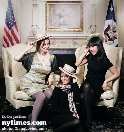
Then we went to a NY Times party at the New Museum, and they had a photo booth. Woohoo! Our pictures totally ended up on the NY Times Facebook page.
Happy Wednesday!
Dust of 100 Dogs
I'm just a fan of A.S. King, a fan of this trailer, and--most likely--a fan of this book (can't wait to read it!)
Woohoo!
Today is the day! I couldn't resist. That's me on my stoop.
How'd I do it? Visit I Heart Daily to find out!
PS-Original photo by the awesome Quito Ziegler.
Cover Stories: Frenemies and Faketastic, by Alexa Young
The fabulous and funny Alexa Young released Frenemies #2: Faketastic this month, and she's here to share her cover story--it's a doozy (and one of my favorites!). "I had an idea in mind for the cover of FRENEMIES, but only because my editor sent me some of the early cover concepts a designer had been working on. I loved them--especially one with two separate pairs of girls all over the cover, and the cool bedazzled font. I especially liked how there weren't just two characters representing 'frenemies' but that there were four girls, leaving the reader to decide which of them--if any--were supposed to represent the characters in the book.
"I was never asked for, nor did I ever offer, any cover design ideas. Alloy (a book packager) came up with the initial concept for the series and the preliminary designs (hence the author name in that pic--I hadn't been hired to write the books yet!). I just figured they already had a vision for how the series should look. I'd coauthored one nonfiction project in the past and had a TON of input into how that book looked--but that was with an independent publisher and it was nonfiction. My assumption--accurate or not--was that I was just supposed to focus on the writing and let the industry veterans handle everything else on this one. :-)
"I think the first mock-up had stock images of supermodels. (I'm pretty sure I recognize at least one of them from a runway show.) But the girls who appear on the covers of FRENEMIES and FAKETASTIC and on the website were all models that were shot specifically for the series. (The dog on the website is actually my dog-niece--my brother and sister-in-law's dog, Leona!)
 "This is going to sound HORRIBLE, but I wasn't all that happy with the cover of FRENEMIES the first time I saw it. Let me immediately follow that up by saying that I'm the kind of person who doesn't like ANYTHING at first. My husband makes fun of me for this all the time. I take a really long time to warm up to things. I'm not terribly good at adapting to new people, situations--anything! That said, it was difficult to see something that was pretty different from what I'd been shown initially, except for the bedazzled font which I loved. The hardest part was seeing a photographic representation of these characters who had only existed on the page and in my head. When I saw that Halley had the wrong eye color and they both had certain physical features that didn't match my description or vision, that was really hard!
"By the time I saw the cover, it was pretty much on its way to the printer, so I didn't have an opportunity to comment or suggest any changes. But once I got used to the look of the cover and I showed it to some other people who liked it, I began to embrace it. I realized that the models weren't supposed to be literal representations of the characters in the book but rather representations of the concept--two best friends who become worst enemies. I do love the beachy feel of both the FRENEMIES and FAKETASTIC covers. I love the colors.
 "And, as much as I loved the step-back/keyhole cover for FRENEMIES, ultimately I'm glad they decided to change that for FAKETASTIC. I think it's much cleaner and eye-catching with the full cover image of the girls--and I like that it's two new models, which sort of reinforces the fact that these are all just sets of 'frenemies,' not specifically HALLEY and AVALON. I do feel like these girls don't look nearly as fashion-forward as they should. (But I don't look nearly as fashion-forward as I should, either! :-)
"Of course, the cover that wins--hands-down--for me is the FRENCH cover:

 "I love every last detail of it: The way the girls look super-stylish (especially the shoes)--but in very different ways from each other; the fact that they look very much like they're described in the book (with the right eye colors!); the subtle destructive images of bombs and skulls-and-crossbones; the way Halley is sticking pins into an Avalon voodoo doll and Avalon is drawing a picture of Halley as a pig (even though Halley is the artist--that might be one tiny change I would have made).
"I seriously could not love this cover more. I can't wait to see what FAKETASTIC looks like--and what the title for that winds up being. I'm hoping they call it FAUXTASTIQUE! The book doesn't come out in France until June, so we'll have to wait a bit to find out all the details on that."
This is a great cover story, Alexa! Lots of drama, emotion and sparkle--just like in the books! Also, on the keyhole cover thing (you know I love me some keyhole covers), bookseller E. Kristin Anderson explains that they're sometimes evil on the shelves.
So what do you guys think of these covers? I'm with Alexa--the French ones are tres jolie!
PS-Still time to enter to win a copy of Violet in Private from Harmony! (And she's also hosting a contest to win Jessica Burkhart's debut, Take the Reigns.)
