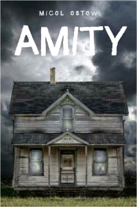
Micol Ostow's 12th (!) original novel, Amity, is the story of a haunted house told in two separate perspectives, ten years apart. I have read it and it is truly terrifying (and beautifully written), with a cover to match. Here's Micol with the story:
"I think we all always knew Amity was going to have an image of a haunted house on the cover. It’s iconic and classic for a reason, right? We may have tossed around the idea of focusing in on one aspect of a house – a window, a door – or even doing something more modern and all type, but I don’t think any of those concepts were seriously on the table.
"My editor at the time showed me an early mock-up with the image they were planning to use (right). She made it clear that everyone in-house was very enthusiastic about the image, which, as I know from my own days on the editorial side of the desk, is pretty crucial and not to be ignored.
"I liked the general idea of that first cover and I really liked that Egmont was truly capturing that straightforward, 'HORROR novel,' genre vibe. My main concern was only that the house itself looked nothing like the building that’s described in the book, or the original 'Amityville' house. Specifically the half-moon windows are mentioned a whole bunch in the book, and are familiar to anyone who knows anything about the original Amityville crime. But I can appreciate that a strong cover can often outweigh the value of a literal cover. We talked a bit about how the house in the mock-up looked small and not quite menacing enough, and my editor assured me it would be tweaked.
"And it was! And it’s amazing and perfect!
"As you can see, the final cover is the same original image. But with the color adjusted, a new font, and lots of creepy blood dripped, the terror factor is amped way, way up. I could seriously marry this new final cover, and I’ve been thrilled with readers’ reactions to it! The general consensus seems to be that it’s insanely scary. Which to me translates to: mission accomplished!"


