The winner of Jenny Han's The Summer I Turned Pretty is... Iryna! Send me your address, I. You are going to loooove this book. I'm halfway through (I'll send after I finish!) and totally swooning. I am so ready for summer! Today Brian Sloan is here to talk about his cover for A Really Nice Prom Mess, which involves boobs and big-chain objections! Let the story begin:
"Prom, of course, is a huge genre for YA fiction with a lot of books out there on the topic. A REALLY NICE PROM MESS is about a secret gay double date to the prom that doesn't stay a secret very long, leading to an all-night long series of adventures/ catastrophes involving strippers, drug dealers and a good chunk of the DC police force. I think the key thing for me in thinking about the cover was trying to come up with something that would differentiate this book from all the other prom titles since it does not tell your average prom story.
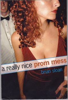
"I talked with my editor, David Gale at Simon & Schuster, about the cover before they started working on it. Starting out, David and I discussed a very general concept about having an image that would seem like a snapshot of the couples in the story as opposed to a more formal looking cover photo. Also, the snapshot concept seemed in line with the book's take on the prom, which is this haphazard night that spins out of control. So we thought a photo that looked like it was taken on the fly would capture that idea.
"David Gale knew this photographer whose work he really liked, Sam Bassett, and got him to do a full-on professional shoot. They hired some actors that were close to the characters, though the woman was given a very convincing red wig to match her character's hair in the book. I thought the guy who 'plays' Cameron on the cover, Daryl Crittenden, looked so right that I had him do some readings with me, actually. I wasn't really involved in the process of the photo shoot which was probably for the best. I'm also a film director so I probably would have driven everyone crazy!
"The first time I saw the cover, I thought it was awesome! Honestly. I thought it really captured the essence of the book; that this was not a traditional prom story but something more unusual. Not your mother's prom book, as I liked to say. Sam created such a great image which said just enough about what to expect in the story, a little chaos and a lot of sexiness as well as some angst, without giving too much away. And the picture itself had a certain artfulness to it as well. Once they sent it to me, I was showing it to anyone and everyone I met, like a proud parent... 'Look at my book cover, isn't it cute!' :)
"I really didn't have any suggestions on the front cover. I think the quote on the back was changed, which was an excerpt from the book, but I really thought the cover was close to perfection. Then Barnes and Noble got involved. S&S always sends their covers to the B&N sales reps to get their comments before finalizing the covers. B&N doesn't have 'approval' of covers but publishers definitely pay some attention to what they say, given that the chain is so key to any book's success.
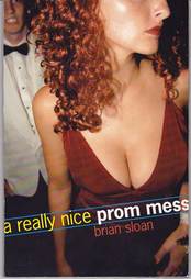
"Well, B&N had a bit of a problem with the girl's cleavage. They said they could sell the book with the original cover design but that they would not be able to promote it in-store because of the prominent décolletage. It seemed a little odd to me frankly, giving the sexiness of other YA covers where girls are in bikinis and bras. But there was something about this particularly ample cleavage that really bothered them for some reason. Anyway, there was a lot of discussion about what to do at S&S.They looked at other images from the shoot but decided that this one was definitely the best. So they stuck with it and the art department made a small clever change, moving the title up over the breasts and adding a white screen to shield the public from the damaging effects of cleavage. This was enough to assuage B&N and the situation was peacefully resolved. Here are the before and after shots to compare:

 "It was a little frustrating because I think, graphically, the original design was so great. Also, I felt the uncovered cover was sorta subversive in that the racy image might catch the attention of those notoriously reluctant boy readers, even though the narrator is a gay teen. In the end, though, the original cover is basically still there. However, I think you do miss a bit of the effect with her chest covered by the title. But it was better to have B&N on-board than put up a huge fight over it. I think the great irony in all of it is that my book is about a gay male couple going to the prom and the thing that got them bent out of shape was the fake-date's boobs. I can't even imagine what would have happened if we put one of the strippers on the cover!"
I love the drama of Brian's Cover Story! I also love the main character's stricken expression on the cover. What do you guys think?