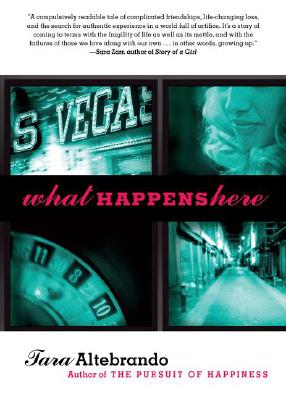
 Tara Altebrando's What Happens here has rave reviews from many sources, including ellegirl.com and author Sara Zarr, who calls it, "A compulsively readable tale of complicated friendships, life-changing loss, and the search for authentic experience in a world full of artifice."
Why have I not read this one yet? Because I'm lame and buried under books. But I will get there! Anyway, the book also has a cool Cover Story. So here's Tara!
"One of the four pictures on the cover of What Happens Here wasn't actually there on the original version. Can you guess which one?
"Well, I'll tell you.
"But first, a little back-story: After a few title changes, we all finally decided on What Happens Here and my publisher felt strongly that she wanted the art to get the Vegas setting implied by the title across more directly. I did my usual obsessive searching on Getty Images and found a few cool imagines of two teen girls in Vegas-y settings (since two lifelong friends are at the center of the story) and sent those in to my editor for inspiration.
"Then the first version of the cover arrived in my inbox featuring none of those photos (of course!) and I took one look at it and thought, 'Okay. Me likey. Sort of.'
"Usually the first time I see cover art, I cry, so this was progress.
"I thought the tone was right. Dramatic. Dark. I liked the big white space at top that would eventually allow Sara Zarr to blurb the heck out of the book. I liked the fact that the surveillance camera aspect of the plot had been used to interesting effect.
"But there was one image among the four that didn't sit right with me at all. See that blonde girl in the top right photo? The bottom left photo was another angle on her and she had what I could only think to call a 'come hither' look in her eyes. She looked about 25 to me. And way too sexy. Like working girl sexy. So I said so and asked that the image be changed.
"'To what?' my editor asked. We talked for a while about putting in the Eiffel Tower since the book also has a lot of scenes set in Europe and also in the casinos in Vegas inspired by Paris, Venice, etc. But everyone thought that would be too confusing. Finally, I suggested a roulette wheel since the narrator is more than a little obsessed with odds and the gambles we all take in life. And they went for it. And once the come hither shot went away I felt like the model no longer looked too old and sexy but just old and sexy enough. Because the book also rubs up against some issues surrounding teen girls dressing sexy/looking older/drinking while underage.
"Ultimately I think the bottom right image--the dark alley--is the one that makes the cover the most effective. I hope people look at that alley and want to know what happens there."
Did you guess the right photo? I was thinking it was probably the alley that was added. Wrong! Anyway, I'm into the film-strip look of this cover, and the colors definitely convey the darkness of loss. I like the way the pink title pops, too. What do you guys think?
 Shop Indie Bookstores