 Carmen Rodrigues has a new book out today! It's billed as "A dark and moving novel—reminiscent of Thirteen Reasons Why—about the mystery surrounding a teenage girl’s fatal overdose." The Compulsive Reader called it "complicated, emotional and mesmerizing." Sounds good, right?
And that cover? It has a story too. Here's Carmen:
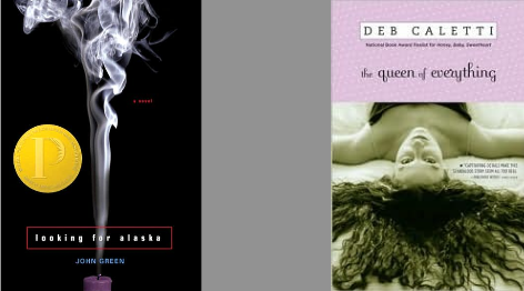
"When I consider a YA book cover, mine included, I like to imagine myself as a fifteen-year-old walking through the aisles of my favorite bookstore, scanning the crammed shelves for something that stands out. What I'm looking for is an image that evokes a mood or a strong emotion. The covers that appeal to me vary. For example, I instantly loved the iconic cover of John Green's LOOKING FOR ALASKA and the human-based cover of Deb Caletti's QUEEN OF EVERYTHING (below).
"I picked up these books based on their cover appeal, having never heard of the writers who, at the time, were not yet famous. These covers screamed, 'Read me, love me, spend your hard-earned money on me!' Of course, I don't buy books based on covers alone. I also read the back cover copy and then a random page inside to see if the voice grabs me. If it does, I buy it. But, the larger point is, I won't arrive at step three if I'm not drawn to the cover.
 "When it came to my own cover for 34 PIECES OF YOU, I was nervous. I had been through this before with my first novel, NOT ANYTHING, and found the cover design for that book (right) to be satisfactory but less-than-inspired. In that first experience, I had pitched several eye-catching ideas which were disregarded. (Ironically, I walked past a YA cover at B&N the other day, which featured a version of one of these discarded ideas and thought, See? I knew that would make a good cover.) For 34 PIECES OF YOU, I was also asked if I had any cover ideas, and I only suggested one--a take on the 'Dear Photograph' concept, which you can see by visiting dearphotograph.com. (Trust me, go there.)
"My reasons for suggesting an imitation of the 'Dear Photograph' style were that 34 PIECES OF YOU is really a series of stories within or interlinked to other stories (there are three, arguably four narrative voices) as well as a story that takes place in both the past and the present. Five years of history is covered in the novel, and I felt that a 'Dear Photograph' cover might really explore that interplay between past and present--how the past is as present as the present. Ultimately, though, we went with something that would immediately resonate with viewers. My feeling is that the girl on the cover (our imagined Ellie) provokes a definite emotional response (dark, moody, mysterious, reckless). Conversely, a 'Dear Photograph' image, while interesting, would require a second level of thought (What is this about?) or a third (Who is this about?), becoming too-much work for a potential buyer who, as a result, might pass it up.
"One of the interesting parts about our cover process was that Simon Pulse decided to hire a model. Photos were submitted to Jen Klonsky, my editor there, and she went through the stack and narrowed it down to a girl who looked like a young Kate Bosworth. I thought she was very pretty (too pretty, really), but when it turned out that she didn't live in NYC and we had to replace her with a different model, one who freakishly resembles Evan Rachel Wood, I was thrilled. This model captures Ellie's grittier beauty, and they did a wonderful job of styling her with all the details that were given in the book: the excessive eye makeup, the hot pink fishnet stockings she's wearing at the time of her death; and the roughness of her attitude, which is mirrored in her jewelry selection. As a final touch, they decided to use a staff member's handwriting for the title and all of Ellie's notes (pieces) on the back. I nearly cried when they emailed me the comp of the full cover! This was my exact reply:
"Screams! Shouts! That light headed feeling you get when you're about to kiss someone for the first time or you're cresting the hill of a roller coaster!
"The final test, though, was when my first ARC arrived in the mail. I placed it in a stack of other YA titles released in 2011-2012. My cover immediately popped out. The spine, which also features 'Ellie,' stared back at me. Her haunted eyes seemed to dare me to look inside. So I did. My hope is that readers will too."
Thanks, Carmen! I think my favorite thing about this cover is the font treatment--the torn paper bits completely intrigue me, and I know they carry over to the back.
What do you guys think of this cover?
