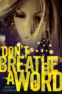
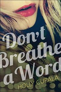
 Holly Cupala was here to talk about the cover of her debut novel, Tell Me a Secret. Now, her second novel, Don't Breathe a Word, is out this month, and it has a cover that manages to convey both darkness and sparkle. Here's Holly with the Cover Story:
"After the gorgeous cover HarperTeen put together for Tell Me a Secret, I knew to expect something fantastic for my second, Don't Breathe a Word… though it came about in a completely different (and for me, much more nail-biting) way…
"The original working title was Street Creed, which is what the design team initially had to work with. The first cover concept was… steamy (below). It featured two gorgeous creatures, probably Italian models, who met as if by chance after a swirling, beaded-dress-bedecked night for an almost-kiss. Sigh.
 "But it didn’t feel like my book.
"Don’t Breathe a Word is the story of Joy, who runs away from home to escape an abusive relationship to the streets of Seattle. She finds allies who have secrets of their own, including Creed—a homeless boy who dreams of making it in the music industry.
"There is a steamy relationship (and Creed is swoonworthy!), but there are no beaded dresses. In fact, the only scene where that dress could have appeared was at a fundraiser party where Joy meets her boyfriend Asher—the dark reason she has to leave. Also, I was worried with the final title, it would look like 'Don’t Breathe a Word about that naughty thing we did after the prom.' No. Oh no.
"The thought of responding to my publisher without effusiveness completely terrified me. Not because my editor isn’t fantastic (she is!) but because conflict is way low on my totem pole of desirable activities. But like I said, my editor is fantastic! She completely understood where I was coming from, and they set to work on a new cover.
"I sent a link to some photos I loved (several of them including bokeh light flares), and here’s what they came up with:
"Love! It captured the movement, the darkness, the grit, and even the glamour of living on the streets.
"But…unfortunately the photo (the original of which is here at iAnton’s flickr) was already contracted for not one but two other book covers. Luckily he had another that we loved even more, and voila, here is brilliant designer Ray Shappell’s final cover:
Thanks, Holly! I think the final image is magical, and I love the hint of huge color without actual inclusion of many colors. Does that make sense? Anyway, what do you guys think?
