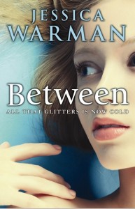
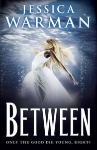
 Jessica Warman has some amazing covers, and her latest is no exception. Check out the Cover Story:
"It’s funny – I’m the most non-visual person I’ve ever met. Truly. My mom is an amazing realist painter, and while I can appreciate the beauty of her work, I just don’t find the visual arts nearly as engaging as I assume most people do. Same thing goes for great scenery, great decoration – anything visual. I see images of the Grand Canyon and am like, 'Yes, it’s beautiful, but… once I’ve seen it, I’ve seen it.' I can remember going to Niagara Falls as a kid and thinking, 'Okay, here we are, I’m looking at the waterfall… what now?' It’s very odd – at least I’m told that it’s odd by my friends and family. My point being: I can never really visualize what I want for a cover, because my mind sort of doesn’t work that way. I tend to think exclusively in a narrative. Weird, I know.
"My publisher didn’t ask for my input at first, but I was shown an early version of the cover VERY early on, and I absolutely loved it. I felt like it perfectly captured the tone and content of the book. I made it my background on my computer, and I’d look at it multiple times a day… which is saying a LOT, considering the fact that I’m pretty deficient when it comes to my appreciation of the visual arts!
"There was also the first version of the Egmont cover for the UK edition of the book (right) with the woman underwater with her hair and dress sort of suspended all around her. I tend to really trust people who do things professionally that I know nothing about – for instance, people who design book covers and know what sells – but I was a bit startled the first time I saw this version. For some reason it felt very 1970s to me, and I’m not exactly sure why.
"For the US version, I’m sure she would have been receptive to my thoughts, but I was so thrilled with what the art department had already come up with that I didn’t have much input to give. The cover was tweaked a little bit. I believe they initially used a stock photo, but were unable to contact the photographer for the rights, and so they ended up doing a photo shoot to come up with something very similar.
 "With the Egmont/UK version, it worked a little differently, because I technically didn’t have much of a say in what the cover looked like. But my editor did tell the folks at Egmont that I was a little lukewarm, and they went back to the drawing board. I’m so glad they did, because I think their final cover (left) is amazing. It’s SO different from their first try, and also totally different from the US cover. I tried to decide which one I liked more, but it’s like comparing apples to oranges."
Thanks, Jessica! I love, love, love the final US cover. The first UK cover definitely has a little disco fever vibe but the final one has a great feel to it. (The US is my favorite though -- cloud swings!) What do you guys think of these covers?
