 Tiffany Schmidt's debut novel comes out October 2nd, but I'm featuring it today because she has a very cool pre-order offer going on right now. The author herself will donate $1 to cancer charities for every pre-order of the book between now and its release date.
In Tiffany's own words, "Send Me A Sign is about a teenager with leukemia. It's about a lot of other things, too: love, luck, music, friends, alliteration… but leukemia plays a large role. And did you know that leukemia is the most common form of cancer for young people?" Tiffany lost a former student last year, and it inspired her to do more to help find a cure -- that's where you come in. Pre-order the book, spread the word... here are the details.
And now, Tiffany's debut Cover Story:
"I first saw my cover in my editor’s office back in December. It had already been an overwhelming day: a chaotic morning drive into NYC with my family and agent – during which one of my 13-month-old twins had been carsick twice, a day popping around the city with friends, and an evening that ended with meeting my editor for the first time.
"After a quick tour of the office and meeting a rapid-succession of the fabulous Walker-Bloomsbury staff, I was starry-eyed. The twins were less impressed: one was cranky from lack of napping, the other was irritable with what turned out NOT to be car-sickness after all, but actually the start of a stomach flu.
"In the midst of all this, my editor said casually, 'I can’t remember, have I shown you your cover yet?'
"She handed me a piece of paper and I froze. It seemed like a moment where someone should cue a soundtrack , or that there should be some fancy close-up camerawork when I flipped over the piece of paper and saw the cover of my debut novel for the first time. I almost didn’t dare look at it. It was too much. And such a public forum for processing it and reacting.
"One of the first things my editor said was, 'You don’t have to tell me you love it right away, if you need time to think about it.'
"As everyone who has read an ARC has been quick to say, SEND ME A SIGN isn’t a Cancer Book. It’s also not an It Girl story. My main character, Mia, is privileged and does have cancer, but because the story is about so much more than that I’ve always had a clearer picture of what I didn’t want on the cover of SEND ME A SIGN than idea of what I did. I didn’t want a cheerleader. I didn’t want a girl in a hospital bed.
"While certainly those are elements of Mia’s journey, but the book is really about HER. About gaining control and losing it. About relationships and pushing people to their limits versus pushing them away. About being in charge of your own destiny, AND embracing being powerless.
"I wanted a cover that said THAT.
 "In my mind it looked something like this (right).
"A nod to Mia’s overwhelming dependence on luck and superstitions, but also to romance. And the cover would take on a second meaning once the readers had finished the book and learned the importance of clovers and heart necklaces within the story.
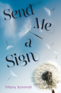
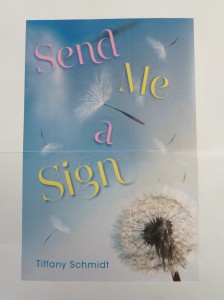
"When I finally looked at the piece of paper with a photo of my cover, I saw that design team at Walker-Bloomsbury had gone in a different direction—no cheerleaders, no hospital beds, but no clovers, Magic 8 Balls or other superstitious icons either. What I saw was unexpected (below, left).
 “It wasn’t instant love for me. My very literal mind thought things like ‘Mia wishes on two flowers in the story – neither is a dandelion.’"
"But I immediately adored the swirly-whirly font—which later lost its pink-and-yellowness and I adore the darker color even more. I also recognized the wistfulness of the image. Both of those really suit the tone of the story. The fact that it looks fragile and evokes a sense of wishfulness works so well.
"And when my editor sent me shots of the way the design had been incorporated in the inside of the novel, I was sold. They’re stunning. (See below.)
"While this cover is nothing like I would have envisioned for SEND ME A SIGN, now I can’t picture it looking any different. I am so lucky to have the design team at Walker-Bloomsbury looking after my books!"
Thanks, Tiffany! I adore the interior treatment--I love it when book design carries into the inside pages. Also, did you guys know that Tiffany's book has a bracelet? It does! Also, that pre-order offer? So very cool. Tell people! Oh, and watch the trailer, too -- this is HIGH in my to-read pile.
