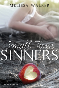
As you know if you read this blog, I'm kind of into covers. So when it comes to the subject of my own covers, I feel especially, um, assertive. I like to give inspiration images, write random things down, and generally insert myself to a point that might be annoying.
When my editor Caroline asked me if I had any cover ideas for Small Town Sinners, I sent her this email:
"I'm going to attach some images and give a little explanation of why they're in the mix for me.
"If we show LACEY: I picture her sort of like an early Sissy Spacek:
**I do really love the close-up on one girl kind of cover, and an American gothic 70s feel seems right to me.
Caroline wrote back to me and said, "We’re definitely on the same page. The first thing that had come to my mind was the description of Lacey from chapter one and the idea of showing her in sort of a dusty sunlight—perhaps a light coming from behind that feels almost spiritual?"
The first version they sent me blew me away! But I felt like the coloring might make the girl seem a little dead (left) so the art department agreed to brighten it for the final (right). Now I love noticing that there's a sun spot in the lens--it's on the bottom right of this close-up (you kind of have to see it in person) and I adore that detail!
Also, I just noticed that the apple bite got bigger (and better, I think)! Remember to enter the apple bite contest to try to win a copy of the book.
So in the end we got a gorgeous cover that went with the first idea and I'm so glad that everyone was really into that concept! I have an interview with the cover designer and then one the photographer of that shot coming next week in Parts 2 and 3 of this Cover Story (you know I have to milk my own!).
What do you guys think of the small changes, the original ideas, etc? I'd love to hear!
Release is just a week away! Yay! Pre-order from your local bookstore or amazon or bn.com or anywhere and I will be super happy!


