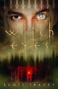
 The first book in Scott Tracey's Witch Eyes trilogy came out this fall, and it seems like a good pick for a Halloween Cover Story!
Here's Scott:
"When WITCH EYES sold, and I first knew that it was going to Flux, I was extremely excited. Some of my favorite covers of the last few years have come out of Flux, so right off the bat, I was ecstatic. There was panic, too, like 'what if my cover's the exception?' but we pretend that never happened. You do that a lot as a writer. Sweep things under the rug or lock them in the closet and pretend you can't hear them whimper.
"Anyway, when it came to the cover, in my head I'd always pictured something in lots of darks and purples. Maybe an aerial shot overlooking a town at night, with all their house lights on and a boardwalk or a lighthouse or something. Or maybe a pair of eyes in photo negative so they're all dark and moody. I think all this is the result of reading too many Dean Koontz and John Saul novels when I was a teenager.
"It had worked out that just before Brian (my editor at Flux) asked me for images from covers I liked, and images that 'fit' the book, I stumbled onto this picture. It was a photo manip that someone had made, and posted on Tumblr. A pair of large (possibly feminine - it was hard to tell) eyes, overlaid above an image of an old castle on fire. I sent it along too, mostly because the idea of eyes overlooking something was fantastic - and perfect for my book.
"Like most covers, it went through several different designs and layouts (which I didn't see) before they finally settled on a concept that everyone at Flux liked. And they showed it to me - a rougher, less colorful version of the final cover you see now. And it was perfect. The only reason I didn't immediately send out emails that said 'OMG YES YES YES' was because I was told to sit on my answer for 48 hours, and then see what I thought. Which makes sense, but at the time I thought it was a horrible idea. Because what if THEY changed their mind in the next 48 hours and I was busy getting attached and making it my computer background and singing it lullabies...
"I had the opportunity to weigh in on the cover, but the truth was that I didn't have a single reservation. I was sure that when the time came, I'd be able to come up with a list of tweaks, of things I'd like to see, or things I didn't like it. But I felt like the cover was absolutely perfect.
"People tell me that my book is dark - I don't see it that way, but I definitely think of it as 'serious.' As serious as a book about a gay witch cursed with magic eyes who walks into the middle of a feud between powerful warlocks can be, at least.
"I've always been a fan of darker, somber covers. There are so many elements of the cover that I love, it's hard to boil it all down into individuals. The fencing at the top is one of my favorite elements, because there's definitely a sense of being 'trapped' that runs through the book. The lightning around the eye, and the way it discolors the skin there (making it look like an almost healed bruise), the super creepy mansion with the single lit room, bathed in red light. I even love the way everything is blurred and bleeding up and down."
Thanks, Scott! I'll add that I think the trees have a Twin Peaks feel that I like, and I'm a fan of the creepy font too. What do you guys think of this cover?
Happy Halloween!