 Beth Kephart has shared many Cover Stories in this space--for Undercover and House of Dance, for Nothing But Ghosts and for The Heart is Not a Size. Her latest novel is high in my pile, and it should be in yours too! I dare you to read a Beth Kephart book and not sigh at the beauty of her words. She's truly a poet (check out her blog for proof).
Here's Beth talking about the cover of her new novel, You Are My Only:
"For many months I have wondered just how I would write this cover story. In some ways, I still don’t know quite what to say.
"Should I start with the title, You Are My Only, which sets the mood? And if I start with the title, then aren’t I really starting (or shouldn’t I start) by thanking my agent, Amy Rennert, and her colleague, Robyn Russell, who helped me toward knowing what the title must be during a week of grave uncertainty?
"You Are My Only, then—a title that I was helped toward. Words that struck me once, and strike me again today, as singular and brave.
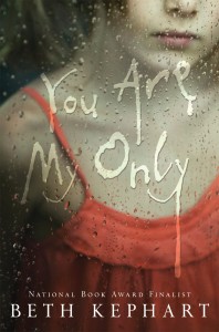
 "To create the image, we turned, of course, to Neil Swaab, who had designed the gorgeous cover for Dangerous Neighbors [read that Cover Story on bn.com], and who seems to get books the moment he reads them—seems to settle on that symbol or scene that obsessed the writer or, in this case, kept the writer going. Both of my protagonists—Sophie and Emmy—are caught inside worlds, trapped in places they should not be. Both look out through windows on people and places just out of reach. What might symbolize that? What single image might tell the story of two young women separated by time and place and hurt?
"Neil Swaab seemed to know at once. He found a photograph taken by the tremendously talented Yolande de Kort. It said trapped. It still said beauty. It was right. Neil made that image his own—adjusting its orientation and palette, working the typography so that the words, too, became weather.
"I saw no other cover image for You Are My Only. I did not have to. I can’t even imagine this book with any other title, any other photograph, any other typography. Sometimes things just work, and I am grateful to Laura Geringer, who brought Neil Swaab into the Egmont USA team, for making this cover work for me. It doesn’t mean to be scary. It means to suggest. It means for readers to look past the surface of things and into the hearts of others, to see what truths lie there."
Thank you, Beth! I am a sucker for a rain-soaked window, and the orange of her shirt and the muted lip color... so pretty and soft. This is one I will savor reading.
What do you guys think of this cover?