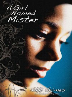
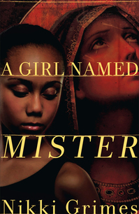
 A Girl Named Mister, by Nikki Grimes, came out last fall. Kirkus Reviews says, "This novel in poetry looks clearly at both teen pregnancy and struggles with faith. Mister is exceptionally well characterized...The language is intimate and immediate."The cover is one that I've stared at a bit in the bookstore, so I had to ask Nikki about the back story. Here she is:
"OMG, I am so in love with the current cover, I'd completely forgotten what it took to arrive at it! I had no musings on a cover when I wrote the text. I never do. But when it comes to covers, I definitely know what I do or don't like when I see it.
 "I remember the original cover proposed to me (right), and I shudder. It featured a young girl who was too mature, and worldly-wise for Mister, and a very stilted image of Mary, which did not align with the fresh-faced young teenager I had in mind. In fact, I wrote Mary as though she and Mister were the same age, while the Mary they had first chosen appeared considerably older. I expressed my concerns to my editor, and the designer went back to work on a new comp. Boy, am I glad!
"If I remember correctly, the trailer and cover were both in production around the same time. I was asked to select one of three possible actresses for the trailer, and the young lady I chose was used for the cover profile, as well.
"When I saw the final cover, it took my breath away! It couldn't be more perfect.
 "The young lady I chose for the trailer and, as it happens, the cover, had the perfect blend of innocence and maturity that matched my character. The flower design that overlays the left side of the photo suggests a blossoming which is on point, too. Mister grows and blossoms in important ways during the course of her story.
"One key feature that makes this cover work is the angle the girl was shot at. She appears to be stepping out of the darkness, into the light, which of course is what Mister does in the story. Brilliant!"
Thanks, Nikki! I think the cover conveys a lot of emotion, and looking at the full spread, I love effect of the illustrated edges and the blue and yellow combination.
What do you guys think?
PS-Watch the trailer, starring the cover model: