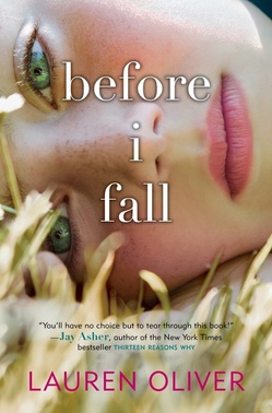
 Lauren Oliver's Before I Fall is one of my favorite books that I've read in 2010--I really loved the voice. Sarah described the book as "Groundhog Day meets Mean Girls," and I think that's spot on (read Sarah's review here to learn more about the book).We're here, of course, to learn about the cover! What else? Here's Lauren:
"You know what? I really didn't have an idea for the cover. I am probably the least visual person in the world, weirdly enough. When I have to memorize phone numbers, for example, I memorize the sound of them. I just realized this recently. I have essentially the opposite of a photographic memory, and again, almost no visual sense. Maybe that's why I almost failed Photo 1 in high school.
"My publisher didn't ask for input, but I trusted them completely. HarperTeen is renowned for doing gorgeous covers; I want to eat all of their books. There is nothing an author likes better than a book that will sell by virtue of the cover alone, regardless of the quality of the text itself! It's a huge relief.
"When I first saw my cover, I was stunned. I thought it was breathtaking, literally.
"Originally we felt the cover was too summery; the grass was too green, the flowers too vivid. My book takes place in February and has a kind of bleakness to it, so it just felt too cheerful.
"The art department took that note to heart. Thanks, Joel Tippie! There were adjustments made to the cover's shade/colors. (Compare below -- original on the left, final on the right):

 "I think it was probably a stock photo. That's my sense, anyway. But I'm not sure a photo shoot could have better encapsulated the feel of the book.
"Initially I assumed that the girl on the cover was Sam, the main character, even though her physical description is very different in the book. But a teen reader actually pointed out to me that she thought the girl on the cover was Juliet--a character who seems minor at the beginning of my book but proves to be absolutely critical. That had never, ever occurred to me, but as soon as she said it, I realized that the girl on the cover does look like Juliet! I like that the cover lends itself to both interpretations.
"I've also always liked that the girl on the cover kind of seems like she might just be lying there, or--because of the pattern of reflection in her eyes--as though she might actually be dead."
And on that eerie note, does it remind you of the cover for Anna Jarzab's All Unquiet Things? Alea?! It's funny because I do think of this book as having a bright, sunny cover, but I see that it was once even brighter, and I'm glad it was softened a bit.
As I said I thoroughly enjoyed the book (and, OMG YES!, of course that's Juliet on the cover! I didn't even think of that!). That won't make sense unless you've read the book, but either way: What do you guys think?