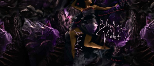
 When I saw the cover for Bleeding Violet by Dia Reeves, I knew I'd have to ask her about the back story. That motion, those colors, that tagline: "Crazy never looked so beautiful." Divine. Here's Dia:"Before I ever got a book contract for BLEEDING VIOLET, I knew that writers had little or no say in what their covers look like... and my experience pretty much proves that to be the norm. But even though I knew I wouldn't be consulted, I thought that I should be prepared just in case. Better to have ideas and not need them, than to need ideas and not have them. I had a list of artists in mind whose work I thought was really dark and cool, like Jonathan Barkat and Saara Salmi, and I had a million cover ideas for BLEEDING VIOLET.
"My ideas for the cover were all creepy, in keeping with the tone of the novel. I imagined stuff like a girl in a violet dress that was dripping blood or even a literal violet in a bloody vase. I also thought of different covers that might illustrate the main character, Hanna's, bipolar state. For instance, a girl with a pretty smile hiding an ax behind her back. I also considered that the cover might focus more on the town itself because it's a major character in the novel. Something atmospheric with lots of dark trees and monsters peering through the leaves or a dark road leading into town full of floating doorways.
"But it was a wasted effort. My editor told me there would be a photo shoot (which was exciting, because most books have to make do with stock photography), and then a week or two weeks later he sent me the results. My initial reaction to the BV cover was embarrassment. I thought it was really sexy. Maybe too sexy. My first thought was that it was a girl writhing around naked in bed.
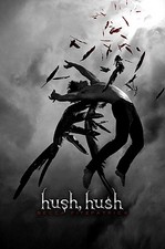
  But upon further study, I realized she was neither naked nor in bed--she was wearing a dress and only writhing around on a bunch of purple fabric (Hanna makes her own clothes and only wears purple, which explains all the fabric on the cover, in case you were wondering). It still looks pretty sexy though. I remember Suzanne Young who wrote THE NAUGHTY LIST (and has a pretty sexy cover herself, right) joking that she and I were gonna bring sexy back to YA. Plus Becca's HUSH, HUSH cover, below, came out around the same time, so that made me feel less alone in my sexiness.
 "So even though I had no say in the process, I really like my cover a lot and so did everyone at Simon Pulse, so there wasn't any hassle of going back to the drawing board and changing anything. I also LOVE that they used a black model on the cover. When I was a kid, I'd have killed to see a black girl on a fantasy/horror book, so the idea that the next generation gets to have what I didn't makes me almost insanely happy."
 I'm happy about that too, and that the cover's true to the story. Also, check out the full wrap, above. The movement and fabric look are fantastic here--it makes me want to dive into a pile of tulle and silk and velvet. What do you guys think?