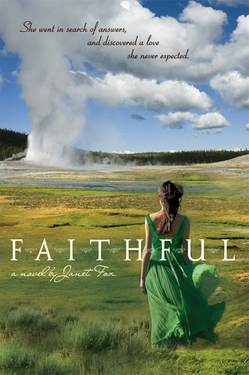
 Janet Fox is here today to talk about the cover for her new book Faithful, which I can't stop ogling. It's almost like a Vogue photo shoot -- the greens, the blues, the spirit of adventure in the air. And, oh, that dress.
Here's Janet to tell us more:
"While I was writing in the early stages, I had no idea about a cover; but as I revised I began to have a vision of it, and most of the images that came to my mind reflected my research. I loved the vintage photographs of Yellowstone and carried around in my mind an image of a girl looking at Old Faithful geyser, but with a vintage feel.
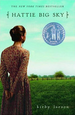
 "My editor asked me for advice! I was pleased and surprised. I don't know that it's common to ask. She wanted me to send her some of the photos I'd collected, especially photos with clothing details of the period and photos of girls I thought looked like Maggie (my protagonist.) And she asked me what I thought the cover should look like, so I wrote a narrative paragraph. I mentioned the cover of HATTIE BIG SKY (by Kirby Larson), which is close to the same period although a different social set, and I sent along a vintage photo taken at Old Faithful (below).
 "When I first saw the cover, I was stunned. It was so beautiful I was speechless. I couldn't believe how closely the designer represented what was in my head, and yet how different in subtle ways - and those differences made it work. I'd been thinking vintage (sepia tones) but the colors and contemporary photo are arresting and much more appropriate for the audience. Really, the cover is completely beautiful. And I want to add, the designer's name is Jeanine Henderson, and I hope some day to meet her and thank her in person.
"I had only one comment, and that was about the nature of the dress that Maggie wears on the cover. I thought it seemed a little bare for the period and for her position - she probably would wear something similar to a ball, but not out in public in the daytime.
"They took my comments to heart, and we had a very cordial discussion about the dress but in the end everyone felt that putting sleeves on the dress or a shawl over her shoulders, for example, took something away from the beauty and simplicity of the moment, or made the cover feel too young or too old. I bowed to the greater wisdom of the art department - and I'm glad I did, for it's truly a winner.
 "I believe that it's a combination of stock photos and modifications made by Jeanine. For example, the color of the dress - that green - figures in the book, and I think she colored the dress and the girl's hair to match Maggie's.
"I love it. Really and truly. I think it enhances the story; it sets the story; I think it sets the period, even though the dress is a tad modern; I think it sets the romance, the longing, and it describes in a subtle way both the loneliness of my character and her growth into herself.
"Oh, and I (along with many other people who've commented) really want that dress! I'm thinking that I might just have that dress made..."
Thanks, Janet! Let me just join the crowd and say: I want that dress! This is a gorgeous cover. What do you guys think?
PS-Here's the trailer. Can't wait to read this one.