Lisa Schroeder's Far From You comes out in paperback this week, and it's got a new cover. I asked her for the back story: "I'm not a very visual person, so I really don't think about cover images when I'm writing the book. I also think it's important to be open to whatever the art department comes up with. I would never want to have my mind set on something specific and then be disappointed because it's so different from what I envisioned it to be.
"My publisher hasn't ever really asked for my input, and I'm okay with that. I've had many people tell me all my covers have been fantastic, and I agree. They know what they're doing, and I trust them to know what is going to represent the book well and sell it!
"The first time I saw the new cover for the paperback version of FAR FROM YOU, I thought it was probably one of the most beautiful covers I'd ever seen. But I also freaked out a little bit because it's more of a symbolic cover than a literal one. If you look at the cover, you'll see it's a young girl lying in the snow, and she has angel wings.
  If people think they are going to be reading a book about a girl who turns into an angel, they will be wrong. There are angel references in it, and I love the tag line - do you believe in angels. But I do worry a little bit about what people might think if they read it expecting something it's not.
"The cover was a done deal. The sales and marketing team were very excited about it and so, the decision was made that it would be the final cover. I'm guessing it's a stock photo that they manipulated to get the look and feel they wanted.
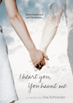
"It's much more of a commercial look than the original hardback cover (above right), and I
  think more similar in looks to the cover of I HEART YOU, YOU HAUNT ME (left), which is probably a good thing for a paperback release.
"I love the cover. I really do. I just hope people remember that covers don't always depict images that show exactly what the book is about. I think people are fairly used to that idea when it comes to images of objects that are put on the front of books, so hopefully they'll realize that can be the case with images of people as well."
I hear what Lisa's saying, and I really like the white softness of the new cover at the same time. Overall, I think it's a win. I think the paperback is more compelling than the hardcover visually. What do you guys think?
UPDATE: Alea of Pop Culture Junkie just did one of her awesome Harcover vs. Paperback posts about this cover, so go weigh in there too!