 The Maggie Brooklyn Mystery series is set in my neighborhood, where author Leslie Margolis also lives! I used to adore mysteries when I was a Middle Grade reader, and the first book in the series -- which was just released this month -- is so adorable that I had to ask her how it happened (I love illustrated middle-grade covers). Here's Leslie:"Girl's Best Friend is the first book in the Maggie Brooklyn Mystery series, which revolves around a twelve-year-old, dog-walking detective. And I must confess - I've been obsessing over what the cover would look like ever since I came up with the idea.
"My editor did not ask for my input directly quite possibly because I never gave her the chance to. When she asked for physical descriptions of my main character and the dogs she walks, I sent those along with this additional note:
"'Brownstone Brooklyn features prominently in the book and it would be excellent to have that represented somehow... I don't want to be difficult at all, but I've been thinking about the look of the book a lot and wanted to send some links to some covers I really like. Here's hoping you find this helpful rather than annoying!'
Harriet the Spy, When You Reach Me and Knuffle Bunny.
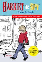
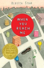
 "Reading this again -- over a year later, I'm sure my email was annoying rather than helpful. And maybe I was difficult, too. But oh well. I had to get it out there.
"Harriet the Spy, Knuffle Bunny, and When You Reach Me are three of my favorite books. They are all city stories and they all have striking covers. And Knuffle Bunny actually takes place in Park Slope, Brooklyn, where Maggie lives.
"Maybe this technique worked, or maybe Bloomsbury was thinking along the same lines, anyway. All I know is that a few months passed with no word about the cover. And then one day my editor told me they were looking at an illustrator named Tuesday Mourning.
"I Googled 'Tuesday Morning' and found a website dedicated to discounted gifts and home accessories based in Dallas, Texas.
"I panicked.
"Then I checked my editor's email again and saw that the illustrator's last name is actually Mourning, with a 'u'.
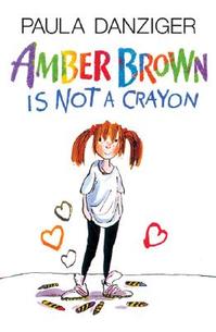 "I did another Google search, found her blog and fell in love with her work. That's before I even realized she'd done the Paula Danziger re-jackets (like the on on the right). I'm a huge Paula Danziger fan, which made Bloomsbury's choice of illustrator even more thrilling.
"Weeks later the first sketch came in (below, left). My editor sent it to me with the following concerns:
"'...I'm not sure about the clothes. A scarf in September feels wrong, and the hat -- though cute -- isn't really in keeping with the character. [Although] it does add mystery and style...
*Does Maggie look too old? I'm not sure, especially since the rendering is so stylized, maybe it's OK.
* I love her sideways glance, though I'd like to see just a smidge more of a smile, to make her more inviting.
* The dog looks pure pug, not puggle (or, of course, Irish Wolfhound). I'd like to see this be a puggle. I'd also like him to be actively pulling her, rather than posing.
Let me know what you think!'"
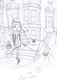 "I agreed, completely. Here's my response:
"'Thanks so much for sending this -- I absolutely love this look. Also -- I agree with you on all points. Maggie in Book One is more of an accidental detective so she wouldn't be wearing that hat -- and there are many times in the book where she comments that it's warm so no scarf, either. She looks a tad old but I think if she were smiling and if her clothes were different -- more casual and less sophisticated but still cute she'd look twelve like she's supposed to.
"'Regarding the puggle, here's how Maggie describes him: 'He's got that smushed-in pug face but a thinner body and longer legs.' So I agree -- the face seems close but the body type could change.
"'Also -- the brownstones in the background look fantastic!'
"A week or so later, my editor forwarded me the second sketch (below, right). As you can see, Maggie has lost her hat and scarf and her outfit is more casual. She's also smiling. And there's a shadow in the background to convey mystery, as well as a magnifying glass in Maggie's backpack to show that she's a detective.
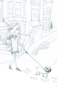 "The puggle is still pretty short, which bothered me at first. But that day, as I walked my own dog past a real, live puggle nearly identical to the one in the sketch, I felt as if the dog-universe was speaking to me and saying this: there are lots of short puggles in the world and why shouldn't they be represented, too? Let this one go!
"So I did.
"Oh, but I did have one other comment. I asked if the magnifying glass in Maggie's backpack could be replaced with a pair of binoculars because Maggie actually uses binoculars in the book. My editor said that binoculars don't say 'detective' in the same way as magnifying glasses. And she's totally right.
"From that second sketch, the artist went to final art.
"And then, I believe, the fabulous Bloomsbury design department took over the task of creating a series look.
"When I first saw the 'maggie brooklyn mystery' banner, it was white and lacked the Brooklyn skyline.
"The next time I saw the cover, it was finished and absolutely incredible.
"When I put Girl's Best Friend next to my worn out copy of Harriet the Spy, I can't help but think that, based on the covers, Maggie could easily be Harriet's long lost, distant third cousin -- one borough removed. Which is kind of how I think of the character, too.
"So all in all, I'm completely enchanted."
 Thanks, Leslie! Okay, first, I looove the brownstones in the back -- they're perfect! I also think the first sketch makes Maggie look like a fashionable high schooler (cool, but not quite the character). And yes, the dog looks more pug than puggle.
But in sketch two, I love the hoodie/leggings outfit, the adorable puggle, and even the shadow of a (menacing?) stranger on the block. In the final, I think the colors are gorgeous and the title banner is awesome.
What do you guys think?