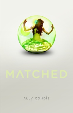
 Ally Condie's Matched was just named #1 on the Winter 2010/2011 Kid's Indie Next List. And its cover is up there among the best of the year too, so I asked Ally to tell that tale, and here she is:
"I didn't have anything in mind for a cover. I'm not a very creative person visually. I certainly appreciate it in others--my mother is a professional artist, and I have grown up appreciating visual art in its many forms--but my mind doesn't seem to work that way. So, I was just excited to see what the designers had in mind!
"My publisher asked for ideas, and I didn't really have any suggestions for them.
"Honestly, when I first saw the cover I wanted to cry. Tears of joy. I thought it was perfect. The model is just how I pictured Cassia looking, but I like that she's in profile so we can imagine her features. The dress is beautiful and has significance to the story, as does the bubble/glass world and the color green. And that particular shade of green they selected is beautiful. I am also a fan of very clean design, and this cover has that in spades. Theresa Evangelista was the designer for the cover and she is amazing.
"Before this cover, there was another concept that Penguin had that we didn't use. It was also beautiful, but this one is even better.
"The final cover was shot with a model. And, in this case, it was a self-portrait! The model and photographer are one and the same, a very talented young woman named Samantha Aide.
"I love my cover. It's a beautiful piece of art and I feel incredibly lucky that such talented people worked on the project. I did find one little piece of hidden meaning that I didn't notice at first. In the book, there are three important tablets that the characters take. The tablets are red, green, and blue. If you look closely at the bubble, you can see very subtle red, green, and blue highlights along the surface. I love that. I think the cover relates to the story in the book perfectly--Cassia is trapped in this beautiful, protective, but ultimately imprisoning world. And, in the end, it is a world that she can break, if she so chooses."
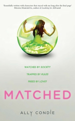
Thanks, Ally! I love the colors and the glimmering magic in this cover. I can't believe the photographer and subject are one and the same--what a cool trick. I also found this cover, which may be another version (UK?). I'm not sure... but it adds the tagline, a blurb and changes the title color.
 What do you guys think of the cover?
PS-Here's the news on Crossed, the sequel to Matched.