The winner of an early copy of Lovestruck Summer from last week's contest is... Ellie! Send me your address, E. (Also, I totally agree with you about Sarah Dessen's The Truth About Forever--amazing book!) This week, I'm doing a combination Win-It Wednesday and Cover Story! Leigh Brescia's first novel, One Wish, is being released tomorrow! And it has such an arresting cover that I had to ask her about its tale. Luckily, she's into sharing.
 "When I pictured the cover during writing, I saw a dandelion being blown across the page. In fact, what I imagined is scarily similar to Janette Rallison's new novel: Just One Wish (MW note: Janette's cover story is here). I suppose it's a good thing they didn't hire me to design the cover: it would be like showing up at the Oscars wearing the same dress as Angelina Jolie, and she gets to walk the red carpet first! Yikes!
"WestSide hired an incredible designer, Michael Morgenstern, to do the image. His work has been featured in almost every major magazine and newspaper in America.
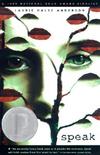
  He also did the illustration for Speak, by Laurie Halse Anderson. I talked to him about what he used to create the image, and he said that he created it in Photoshop and used textures, photographs, and digital airbrush technique. He did an excellent job! I had to use Photoshop in a graphic design class in college, and I wasn't nearly as successful.
"When I first saw the image it took me a moment to really focus and take it all in. The design is so bold and fresh: it was like nothing I'd ever seen--especially not for a YA novel. Of course, I immediately decided that I loved it and made it my desktop background.
"It's different, and it makes you look twice. You're not supposed to judge a book by its cover, but in this case, the image is so intriguing. As a reader, I would want to pick it up to see what the story is about. I think it will make a lot of people curious.
"More than anything, though, I love how the image is metaphorical and mirrors the story. My editor sent the synopsis of One Wish to Michael, and he designed the cover from that information."
"Michael told me: 'I had given Wrenn a streak of reddish hair to symbolize the makeover her theatre friends had given her. It's the brightest color on the cover, calling attention to the change which brought with it new confidence, temptations and troubles. The roses with the steely thorns represent the allure of romance on its surface: dreamy and sweet in appearance but with its thorns that can be damaging as well. In the superficial world of surface appearances, it's easy to get lost. But Wrenn's clear blue eyes will steer her through all this and eventually find truth.'"
"Isn't he absolutely brilliant? He's such an incredible artist, and I'm excited that WestSide chose him to design the cover of One Wish."
I love that we got to hear from both author and cover designer in this one! And I agree that the image is unique--that red hair streak always catches my eye. I'm behind on my pile, but I can't wait to read One Wish.
To enter win a copy of this book, just share your thoughts on the cover below. I'll pick a victorious commenter at random next week!
Happy release week, Leigh!