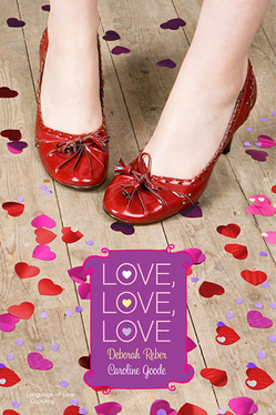
 Happy Valentine's Day! I knew exactly which book I wanted to feature today. Actually, it's two books. And Deborah Reber, author of The Language of Love (one of the books in this two-book set) is here to tell the story behind the cover of Love, Love, Love, which also includes a book by Caroline Goode.
"If the cover story for my book Language of Love were to be made into a movie, it would have as many twists and turns as any good romantic comedy.
"It all started with this cover, below right, which I LOVED. This original cover was illustrated by Ann Zeak, who has designed covers for the more than two dozen Simon Pulse Romantic Comedies, the series to which Language of Love originally belonged.
 "In developing this cover, Simon Pulse asked for guidance regarding the physical description of my main characters Janna (Emma Waston pre-pixie haircut) and Julian (a scruffier version of a Zac Efron/Chace Crawford blend) and any insight I could provide on the setting for the book or a scene that might make for a good cover. And this is what they came back with, right.
"I absolutely love this cover, especially the color scheme, the adorable rain jacket and rain boots, and Seattle's landmark Space Needle in the background. The scene portrayed on the cover stems from the night that Janna and Julian fell in love. Awww...
"But then this cover went away.
"Simon Pulse made some changes with their Romantic Comedies series and decided to repackage them and create 2-book collections in a bigger size with a new, photographic cover treatment.
"To be honest, I was pretty bummed when I found out about this, partly because my book publication date got pushed from June to December, partly because I would rather my book have been a standalone as opposed to packaged with another story, and partly because I loved the original cover so very much.
"So, I was pleasantly surprised when a few weeks later, I received an email from my editor with this image attached:
 "As soon as I opened up the jpeg, I realized I could fall in love again.
"I didn't provide any input on this new cover - the publisher worked hard to create a cover that would tie together the two stories contained within without being specific to either one. To me, this cover is all about the mood it evokes - love, happiness, joy, frivolity, playfulness. And then there are those adorable shoes.
"I've gotten more comments on those little red shoes than almost anything else regarding the book. People have responded so favorably to this design, and that, along with the flat finish of the cover, the layout of the interior, and the bang for the buck (hey, you really can't beat 2 books in 1), makes for a pretty great package (IMHO).
"About those shoes...yes, they are too cute. And no, I don't own a pair. Although I am certainly keeping my eyes open."
 Thanks, Deborah! I adore the final cover -- I think the cartoon covers are cute, but sometimes I think they turn off older readers who might love the romance. This story reminds me of Jennifer Echols's tale about Endless Summer, which combined two of her Simon Pulse romantic comedies (left). You definitely can't beat two books in one, and romantic comedies are such bubbly, fun reads that this seems like the perfect book to pick up, oh, today?
What do you guys think of the cover, and of the change in the Simon Pulse romantic comedies line in general?