 The lovely Saundra Mitchell is here today with a rollercoaster ride of a Cover Story for her latest novel, The Vespertine! Here goes:"I didn't have a specific image in mind for the cover, but I knew in my soul that I wanted the book to be in russet, sunset colors. The main character, Amelia, can see the future, but only at sunset--and the book is full of loving descriptions of that time of day.
"My editor, Julie, sent me a note one Thursday afternoon and asked for a detailed description of Amelia, the main character. She told me that the design department was scheduled to start my cover the next day.
"She didn't ask for any particular input beyond that. But I come from a filmmaking background, where we make contact sheets for everything from paint colors, to car styles, to actors. So I put together this contact sheet and forwarded it with my notes.
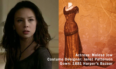 "When I wrote the book, I'd had Malese Jow in my mind as Amelia (I loved her as Anna on The Vampire Diaries) and I'd taken all the clothing directly out of Harper's Bazar, circa 1881-1889. Lucky for me, costume designers do the same thing. The exact gown that Amelia wears in my book is the same pattern that costume designer Janet Patterson used when dressing the cast of Portrait of a Lady. And of course, everything in sunset colors, because that's how I saw the book.
"The first time I saw the cover, I cried! Because what I saw first was the concept art for the cover. I was in New York for the very first time. Julie, my editor, took me on a tour of the offices, which ended at her desk, where she'd just gotten the preliminary art for my cover.
She turned on her monitor, and there it was:
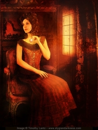 "It was perfect! There's the girl! There's the dress! There are the sunset colors, and even the necklace that Amelia gets during the book!
"Regina Roff, the designer at HMH, owned a deck of Archeon Tarot by artist Timothy Lantz. She thought he would be the perfect artist for my cover, so HMH contracted him and he was available. It's gorgeous, gorgeous art. I loved it so, so much. I could go on for hours about the details, but seriously. It made me cry; it was extraordinary.
"So... of course it had to change.
"There's a feeling in the industry that illustrated covers are for juvenile and middle grade novels; photographic covers are for young adult novels. And a lot of people have a say on the final cover.
 "After a lot of discussion in-house and with some book buyers, people felt that a cover with Mr. Lantz's extraordinary art fell too close to illustration. I was devastated! When I found out it was changing, I sent a note that said that I wouldn't mind seeing a new cover modeled on Melissa de la Cruz's Blue Bloods covers (right), or something wholly iconic. But I honestly didn't know what to expect.
"On the second round of covers, my agent and I had more input. HMH kindly put together three comps, and I was so anxious. After loving the first cover so much, I was prepared to pick the new one based on the art I hated the least.
"But when I saw the comps, I loved them all. They were gorgeous--and really varied. It was so exciting to see so many different artist conceptions of my book. My agent and I had some notes, which my editor took to the jacket meeting.
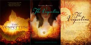 "My fave was actually #3, but I knew at the time that it wouldn't fly as a YA cover. After the jacket meeting, HMH decided on Comp #2 as the final cover. And my only issue was that the clothes we could see were anachronistic to the book. I asked them to hide that as best as they could, and they did a fantastic job of doing that. Plus, it was really exciting to see that they used the exact pendant I'd put in the book right on the cover! And thus, I had a final cover, which was this:
 "So I was really happy again, because once again, HMH had gone above and beyond to create a really meaningful cover for this book. But...
"I had a lot of fun unveiling the final, got lots of neat stuff printed and then... My editor called. She was incredibly apologetic, but they were changing the cover again. People felt the second cover was still too illustrated looking. Everyone really wanted a clean, photographic cover with a lot of BANG to it.
"The second cover had already gone out on digital ARCs, but they were trying to get the new cover done in time for print ARCs. It was looking less and less likely though, because another publisher was interested in using the gorgeous image they'd selected for the third cover. The stock company would only license it to one of us, so it was a nail-biting several days.
"But finally we got word that we could use the image, and so my designer put together a stunning new cover. I cried again, because it was that gorgeous. And here it is:
 "It's remarkable how much that model looks like Malese Jow. How amazing that dress is. How much I want to just grab it and hold it and show it to the world. Friends have called it The Luxe with Motion, and I think they've nailed it. It's just screamingly beautiful.
"The original art is a photographic illustration by Timothy Lantz. The second cover was a stock photo, edited by Regina Roff. The final cover is a photograph by Susan Fox, edited by Regina Roff.
"In the end, I love it. I just love it. Beyond being a great cover, I think it's a truly beautiful piece of art. It captures a moment in the story, but more than that, it really reflects the mood and sensibility.


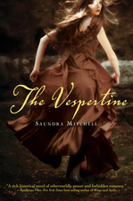 "There's so much storytelling going on in the image too. I think it's mysterious and wonderful and you know what? The first cover showed the girl and the dress from my contact sheet. The second cover showed the exact pendant I'd put in the book. And the third has the girl and the dress again. Every single one of these covers emphasize how much care and thought everyone at HMH has put into my book. It makes me smile every time I see them--all three of them. I'm a lucky, lucky author indeed."
Thank you, Saundra! I love an epic Cover Story, and this one certainly qualifies. I have to say, I'm a sucker for flowy dresses, and I'm so happy that the cover ended up where it did -- it's gorgeous!
What do you guys think?