 The lovely Maryrose Wood is here to share the stories behind the beyond-amazing covers of her Morgan series (you guys must have read/seen these magical books, yes?). The third title, WHAT I WORE TO SAVE THE WORLD, was just released, so now seems the perfect time for Maryrose's Cover Story. Here goes:
"I didn't have an idea for the cover. I love the visual arts and find them a great source of inspiration and creative rejuvenation (perhaps because they force my hyper-verbal brain to think on the other side), but I don't ever imagine book covers as I'm writing. It's hard enough thinking of titles!
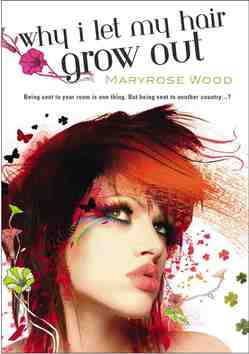
"At some point while I was finishing up WHY I LET MY HAIR GROW OUT, the first book in the series, I got an e-mail from my editor that said: 'The art department wants to know what color Morgan's hair is.' Morgan is the main character of the book.  So I tried to explain: 'Well, it was originally strawberry blonde, but she died it black, then cut it off, and the stubble is now streaked orange, so your guess is as good as mine...' I had no idea why they wanted to know until they sent me the finished cover to look at.
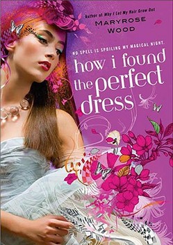
"For the second book, HOW I FOUND THE PERFECT DRESS, I recall that there was more discussion because they were suggesting titles for the book, and we were simultaneously trying to come up with an image to match the title. The word 'wish' was suggested at one point, and the image of a candle, but I just couldn't make it work (it is Morgan's birthday in that book, but to me the birthday candle/wish thing seemed both too on-the-nose and not quite what the book was about).I was glad that we ended up with HOW I FOUND THE PERFECT DRESS, which I thought was concrete and fun, and the ironically pink prom dress Morgan wears in that book is an important part of the plot. The cover used lots of pink and a very magical-looking dress.

"WHAT I WORE TO SAVE THE WORLD was also a title that was late in coming, but the art department knew all along that there should be a dark, nighttime feeling to the background and that Morgan's locket would be featured. Both choices are perfect for the book.
"With the first book I was knocked out by the cover, I thought it was just gorgeous. I had had no idea what they were planning to do, so it was a happy surprise. I was also a little nervous, because it looked quite different from any other YA covers I had seen. Of course, as soon as the readers saw it we heard nothing but raves. I still get tons of compliments from readers on all three covers. A lot of them say WHAT I WORE TO SAVE THE WORLD is their favorite, though!
"My editor was always open to comments from me and from my agent, but honestly, all three Morgan covers came out of the art department pretty much the way you now see them. Our comments were mostly along the lines of, 'Wow, you guys did it again.' On the third book I did make some minor comments about the type treatment. Some little adjustments were made for the final version, which I think looks fabulous.
"The three covers you see look very much the way the looked when I first saw them. I should point out that this could be considered unusual. Many of my author pals angst terribly over covers and get deeply involved with the design process if the publisher doesn't come up with something spectacular right away. With the Morgan books I was lucky!
"I knew that artist Sarah Howell created the illustration. Starting with a real photo and adding fanciful computer illustration is typical of her work; you can see many gorgeous examples on her website (MW note: So cool! Definitely click that link!). But I didn't know where the original photo came from until I received an email from a very nice woman who said, 'You don't know me, but I wanted to tell you that my daughter is on the cover of your book!' I was gobsmacked! She was the one who told me the story. Her daughter had taken a modeling class, and the test shots from the class were sold as stock photos. The daughter had no idea the photo had been used on a book cover until a friend of hers saw WHY I LET MY HAIR GROW OUT in a bookstore and called her cell phone, screaming.
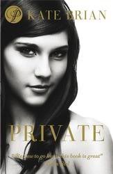
 "The thing about stock photos is that keep turning up. I recently learned (from those eagle-eyed readers!) that the photo used as the basis for the WHAT I WORE TO SAVE THE WORLD illustration also appears on the UK cover of PRIVATE. It's fun to see what the photo looked like before Sarah Howell got hold of it. Of course, I prefer my cover!
"I love all three covers. They're distinctive--you know it's a series right away--as well as being beautiful. Best of all, they capture the essence of the books, which combine the real life and faerie-world adventures of a teen girl with a strong, vivid personality. Morgan Rawlinson, the main character in the series, is a sassy, sarcastic, lovably bad-ass kind of teen girl, with relatable feelings of being cranky and insecure and rebellious and all that. I love that the girl on each cover is not merely pretty, but also intriguing and unique-looking. I think all three show a little spunk beneath the faery glitter!"
I have long admired Maryrose's covers, and I think all three are just gorgeous. Honestly, I think I like WHY I LET MY HAIR GROW OUT, the first, best. I was enchanted at first glance. You guys?