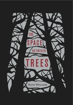
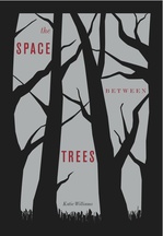
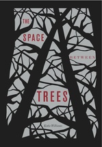
 Katie Williams has one of the most jump-out-at-you covers I've seen in a while. It's got three dimensional cut-outs. Seriously! It's hard to do the cover of The Space Between Trees justice in this 2D format, but hopefully you've seen the book in person (if you haven't, definitely seek it out).
Here's Katie with the Cover Story:
"I'm superstitious, so as I'm writing something, I try hard not to think about the will it? or won't it? of publication, and that includes dreaming up cover designs. I must be very strict with myself! In fact, I try to pretend that I have the demon hand from the Evil Dead movies; my left hand may be sending out stuff to editors or my agent, but the rest of me is writing away in an oblivious, artistic bubble.
"Once I found out that The Space Between Trees was accepted for publication, I suppose I may have entertained a cover daydream or two. I probably imagined we'd end up with the body part of a girl--so popular these days--but I never imagined anything as cool as what Chronicle did.
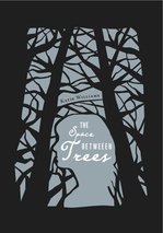 "Chronicle is so good to their authors! My editor asked my for input on the design. She had the idea of the cut-out branches and negative space, which came from the title (also, her idea). I suggested that the tree branches might form the outline of a girl's face, and the art team even mocked that up for us (right). In the end, though, it was too subtle an image for someone glancing at a bookshelf packed with enticing covers.
"The cover of the ARC (advanced reader's copy, above) used a red, gray, and black color scheme and no girl outline. (It also has a typo; see if you can spot it!) But even though the novel isn't girlie, the two main characters are girls, and so Chronicle quite rightly wanted to appeal to that readership. To do this better, the designers added the girl outline and changed the color scheme to a very sharp metallic lavender, below:
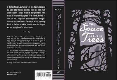 "Okay, I'm not lying here. When I first saw my cover, I genuinely thought, I hope readers judge my book by its cover. I couldn't believe how different it was, how gorgeous, how evocative.
"The cover design--tree branches with the title and image peeking through between them--comes from the title, which is, in turn, taken from a sentence toward the end of the novel. One of the themes explored in The Space Between Trees is that what is not there--a memory, an idea of someone, a lie--can sometimes have more power than what is present and true. The spaces between the trees can be more powerful than the trees themselves. The cut-out cover, which one can open and peer through, expresses this idea better than any flat image could. It truly is the perfect cover for my book."
Ahh. It's gorgeous and unique. Thanks, Katie! I can honestly say that I see hundreds of covers and this one is just, like, BAM!
Have you guys seen it in person? Let me know what you think.
PS-I just had to ask Katie where the typo was, and it's indeed on one of the covers shown here. Ack! So mad I didn't see it. Can you find it? I'll send a mystery gift package to the first person who comments with its location (click to enlarge the covers for a closer look).
