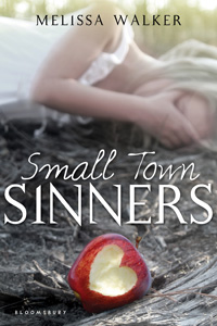
(Read Part 1 of the Cover Story.) Ooh, I forgot! I wasn't sure about the title font at first (but I was wrong). The art department indulged me and did a bunch of mockups:


Here are the mockups with in block, serif block and the final (image also brightened and apple changed, as noted in yesterday's cover story).
The final font is definitely the best, right? I know I'm leading you to agree with me, but I really think so! It has bite to it (like this contest). And look how much more my name stands out! I didn't even notice that until just now. Really! (But I'm not above saying... I like it.)