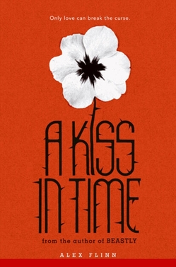
 Alex Flinn, who shared the Cover Story for Beastly on Monday, is back to talk about another of her retold fairytale covers, A Kiss in Time, based on Sleeping Beauty. Here's Alex:
"I don't think I had much input for the Kiss in Time hardcover. I was pleased with the color scheme and general look, but I thought it was a bit bland. I've seen other covers by this designer, such as Fairest (below right) and Princess Ben, and they always have a little something more to them than just a girl in a pretty dress. It was obvious that the cover was 'set' when I saw it. It was a photograph, and they'd spent weeks going through dozens of photos to find the perfect one -- it was shot specifically for the book. I liked the colors and the font.
 "The girl does look like Talia in my book, and the dress is important in the story and is as I portrayed it, the same color as the girl's eyes. But I was a bit disappointed that you couldn't tell it was Sleeping Beauty, as you can easily tell that Fairest is Snow White. That said, it has been a successful hardcover. I do think the cover art has caused it to be mostly overlooked by the young-adult library community, because it makes it look like a younger book. However, bookstore sales have made up for that. It is so pretty that you want to pick it up.
 "My editor and I had discussed a spindle for the A Kiss in Time paperback and, in fact, even looked at photos of spindles on Etsy, but they ended up going a different way. When I first saw the cover, left, I didn't really think the flower had much to do with the story.
"I had originally thought that the flower was a pansy. However, I later realized that it was a poppy (the colors are reversed so that the poppy's distinctive red color is the background color while the flower is white). The poppy is a symbol of both sleep (because of the poppy's relationship to opium, as in The Wizard of Oz) and also, remembrance (such as in Macrae's poem, 'In Flanders Field'), both strong themes in Sleeping Beauty. Indeed, the poppy is a symbol of resurrection in Greco-Roman myth, and Talia and her kingdom are resurrected by Jack's kiss. On the cover, the poppy has thorns and, of course, a thorn-covered wall is strongly associated with the story of Sleeping Beauty. Will readers get all this from the cover? Probably not, but it's pretty."
Thanks, Alex! I like the iconic design of the paperback more than the hardcover, to be honest. I also like how it goes with simple Beastly's design. (And I think the thorny font is cool!)
What do you guys think?


