amanda ashby

Cover Stories: Demonosity by Amanda Ashby

Demonosity.smallAmanda Ashby has shared a few cover stories over the years, and School Library Journal calls her latest book a "frothy romp" that "percolates with lighthearted humor and droll dialogue, while an involving plot and themes exploring friendship and self-reliance add satisfying substance." Yay! Here's the cover story for Demonosity (out this week!):

"Sometimes I get asked by my editor if I have any thoughts on the book cover but I didn’t have any input on this one. Mind you, I’m not great at visualizing things so perhaps after my previous suggestions they decided to skip me out of the process—though I still maintain that a flesh eating zombie would make a great cover because gore rules!

"Anyway, when I first saw my cover for Demonosity, I was really thrilled, especially when I learned that it had been designed by Jeanine Henderson, who has now done covers for six of my books! I’ve always felt that she’s been able to capture the spirit of the stories and bring them to life and she definitely did that with Demonosity.
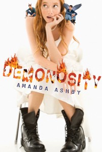
Demonocity_COMP_A

"However, one thing in the draft cover (right) that I didn’t like was the two guys who are sitting on Cassidy’s shoulders. They are meant to reflect that she has to choose between them (and either save the world or destroy it) and I wasn’t really a fan. Especially because originally one of them had wings and one had horns, which made them look like angels/devils whereas the two guys are really thirteenth century demon knights! I did discuss this with my editor and while the guys stayed, we did lose the horns and wings, which was a big relief (not least because there are so many angel books around I would hate for a reader to think that they were buying one and then discover it wasn't the case).

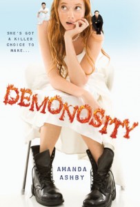
"I’m pretty sure the cover was done from stock photos, mainly because when my middle-grade series got a photo shoot, they told me about it! Anyway, I think they did a great job of getting someone who looked so much like my heroine, Cassidy. And while she probably wouldn’t wear that white dress (she's a vintage girl and never spends more than twenty bucks on an outfit) she would definitely wear those boots and in fact she spends most of the book in Doc Martens and army boots, so I was really pleased to see them there.

"Anyway, overall, I really adore this cover. It reflects the tone of the book and I love that it’s white. Plus, I recently discovered that title font is embossed and so the flames really pop, which is of course the ultimate in rock star coolness!"

Thanks, Amanda! I agree that the guys on the final cover look much better, and the font change is good too.

What do you guys think?

Cover Stories: Sophie's Mixed-Up Magic Series

Amanda Ashby has been here before with the GCC to share stories about her covers, and she's back today with the story behind the Sophie's Mixed-Up Magic covers, her first middle grade series. "I’ve been lucky with my covers and I’ve loved them all, but without a doubt the covers for my Sophie’s Mixed-Up Magic series are my favorite! And I’m not just saying that because they are my first covers to have a head (though heads are cool!) but it’s rather because as soon as I saw them, I just knew that the girl on the cover 'was' Sophie!!!! From her straight blonde hair, her expressions through to the clothes that she was wearing, it was all the Sophie of my mind!

"Sometimes I get asked if I have any thoughts on the cover, but this time I wasn’t and I hadn’t even realized that there was even a shoot until after it was all over. Anyway, I immediately emailed my editor to tell her how thrilled I was. She told me that the girl who had played Sophie was an absolute delight and had totally embraced the shoot. She also told me that the art director was Jeanine Henderson who also did the covers for two of my other books, Zombie Queen of Newbury High [read that Cover Story] and Fairy Bad Day [read that Cover Story]. I love Jeanine’s covers so I was thrilled to discover that she had worked on the Sophie books as well and I immediately asked my editor to pass on my thanks and let her know how much I loved the covers (that's book 2 on the right).

"Then a few weeks later I got an email from the girl on the cover of the books. She was so lovely and I swear she is even more excited about the books coming out than I am! It was nice to get the chance to tell her how brilliant I thought she was and as soon as I got my arcs for book one, I sent her a copy (not all arcs have the real cover on them, but these did and I knew she would want to see it!)

"Anyway, a few months later I got a Google alert and I stumbled onto Jeanine’s blog, where she was talking about my Sophie covers!

"The post was about how she had been commissioned to do some hand drawn covers and that even though everyone had loved them, in the end it had been decided to do a photo shoot for the covers (which Jeanine was the art director for it).  I’ve attached two of the original covers (below, books 1 and 3 have an illustrated comparison) and I love that her hand lettering was used in the final version!

"As for any surprises, I actually only received my author copies last week and while I had seen an arc for book one, I had never seen one for book two, so it wasn’t until last week that I realized that the ring Sophie is wearing on the cover IS the djinn ring I described in the book (an apple shaped rhinestone ring. Because obviously if you are going to have a djinn ring, it should be pretty and sparkly and shaped like an apple!!)."

Thanks, Amanda! I think the photo versions are great for Middle Grade, and I like the photo shoot versions--so glad the model looks like Sophie!

What do you guys think?

Cover Stories: Fairy Bad Day

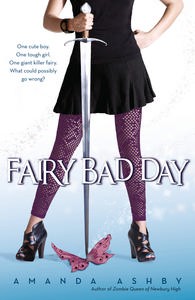
The lovely Amanda Ashby is here to talk about the cover of her latest book, Fairy Bad Day (read a review from Supernatural Snark), which, as you can see, has tons of personality. "I had no idea of what the cover would be like when I was writing it (hahaha—most of the time I was pretty sure it would never even reach the stage where it would have a cover!)

"My publisher asked for input, and I went and looked at a whole heap of covers to give me some inspiration. I found quite a few adult urban fantasy books that had headless characters who were leaning on a sword and I really loved them so I mentioned the idea and then, to my complete surprise, that’s what I got!

"When I saw the design, I was stunned! I had no idea that they were considering the idea I’d sent them but of course they made it so much better than I ever could’ve imagined. My favorite part, apart from the sword was the wonderful little white stars that sort of spiral up. They really pop on the real cover!

"My agent wasn’t convinced of the outfit and thought it was a big dowdy but since I quite liked it (my heroine is definitely not into fashion) in the end we just asked for the skirt to be shortened. My editor was totally fine about that (she actually seemed a bit amused that that’s all we asked for!). I’ve always assumed that that they shot it, but I guess there are stock photos of everything. I actually only learned quite recently that it was designed by the same person who did my Zombie cover, right [read that Cover Story here], which is pretty cool!

"The original tagline was 'A boy, a girl and on giant invisible killer fairy.' However, we always knew that we were going to tighten it and in the end we came up: 'One cute boy. One tough girl. One giant invisible fairy. What could possibly go wrong?'

"I’ve just received one of the Australian copies (my US copies haven’t arrived yet) and it’s soooo much cuter than the arc covers. It’s deliciously glossy and the stars really seem glittery!"

Thanks, Amanda! Glossy and glittery--you're singing my tune. Plus this cover made me laugh, always a good thing. What do you guys think?