 Amy Reed has shared her Cover Stories with me before, and her latest novel's face again uses white space and arresting fonts. Plus a show-stopping girl. Here's Amy with her latest Cover Story for Over You:
"I loved how the designer used simple black line drawings in addition to photos on Clean and Crazy, so I was thinking he’d do something like that to portray the location. I pictured a photo of Max and Sadie (the two main characters) standing next to a hand-drawn ear of corn or barn or something. Luckily the designer had better ideas.
"My editor always asks me to describe the main characters before they start looking for models. I found this email I sent my editor:
Sadie: pink bob. I picture it a bit messy at all times, not like one of those wigs where everything's perfectly straight. There's something naturally sexy and playful about her. I picture her with a constant smirk on her face.
Max: long straight or slightly wavy hair, enough for a pony tail. Blondish-brown--the kind of hair girls complain about having who really want to be blonde. I don't think I specified bangs, but I think she could have longish bangs. Somewhat plain and girl-next-door-ish, but something definitely pretty and intriguing. Usually has a serious look on her face. (like a young, lighter-haired Jennifer Garner?)
 "When I first saw my cover, I thought it was eye-catching and intriguing for sure. But honestly, I kind of wished it was Max on the cover instead of Sadie, since the book is really about Max finding herself. But I guess it’s the same for the cover as the story—Sadie’s the flashy one who gets all the attention, while Max is more quiet and stays in the background.
"The publisher is always open to my feedback, but I don’t think I had much to say about this one. One thing I’ve learned from both having my books published and working at a publishing company is that authors need to let designers do their jobs. Cover design is a combination of art and marketing, neither of which I know much about.
"The original idea was to put both Sadie and Max on the front, but that version was too busy and colorful (above right). They ended up putting Sadie on the front and Max on the back, which I think works well because it’s simpler and matches the covers of my other books with the use of white space.
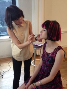
 "I am so lucky that Simon Pulse chooses to invest so much in my covers by casting and shooting live models [see a shot from the shoot where 'Sadie' is getting her makeup done, right]. The best part is when my editor sends me behind-the-scenes photos from the photo shoots, like the lighting set ups and the models getting their hair and make-up done. My editor also told me a little about the models themselves—'Sadie' (on the front) had moved to New York from Lithuania three weeks before the photo shoot; 'Max' (on the back) had been living in New York on her own since fifteen to pursue modeling and acting."
Thanks, Amy! I love behind-the-scenes moments, and photo shoots that result in covers like this inspire me. I also think that the continuity between Amy's covers is very cool and recognizable.
What do you guys think of this cover?

