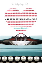
 Arlaina Tibensky's debut novel sounds like something I need on top of my pile. ("Sylvia Plath and an old typewriter usher an angsty virgin through the worst summer of her freaking life.")
Also, the cover spoke to me. So I spoke to Arlaina about it. Here she is:
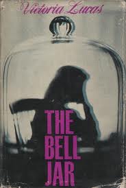
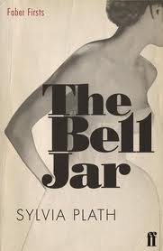
"I had this fantasy that the cover of And Then Things Fall Apart was going to be a newer, updated version of a classic The Bell Jar cover, like the one with the creepy letters and the rose, or the Victoria Lucas (Sylvia’s pen name) with the dark purple letters, or even the cool one with the spirals. Like one of those, but 'updated, for the youth of today!' (See right.)

 "I mentioned my 'Updated, for the youth of today!' idea to my editor… and we never spoke of it again.
"At first first first, I thought the cover was a little too cute. But too cute or not I fell in love, immediately, with the typewriter. The BLUE TYPEWRITER. And my huge ego loved that my name was right there in the middle. I was also happy there were no bodies on it, no anonymous 'teens' acting 'quirky' in stripped tights and pink hair.
"My editor just emailed it to me and said, 'There it is, isn’t it GREAT?!” and I let it sit a little while and then came to agree with her. As I did on most everything she said. It didn't change one iota. They had some placeholder copy at the top that used to say 'Snappy sassy copy here…' That became 'You think you’ve got it all…'
"It is totally a stock photo! I saw it on an image search on typewriters I was doing for my blog. A friend of mine was reading Good Housekeeping magazine and saw the stock photo in the back for some kind of advice column and assumed it was my book getting reviewed! Until she read the column, of course.
"I adore my cover. I love that it’s white, I love that it is a little mysterious. I love that it appeals to a wide variety of readers and also a very specific reader. The book is about so many things; literature, writing, self-examination, virginity, betrayal, love. I think that the image Jessica Handler (the designer!) came up with was really inspired and really represents the book in a way I could never have imagined.
"What’s so crazy is that the typewriter on the cover really resonated with me for some reason. I always was very into it and had a real connection with it from the minute I saw it. So… I’m getting ready for the launch party and asked my husband to get some of my vintage typewriters out of storage to bring to Books of Wonder. He brought back two, a brown number and-- are you sitting down?-- THE VERY SAME TYPEWRITER from the cover. Black and red ink, blue case. Do you have goosebumps? What are the odds?"
Thanks, Arlaina! Love it, love the coincidence (fate?), love the colors on the cover and love the sound of the insides. Always the most important part, of course.
What do you guys think?