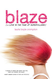
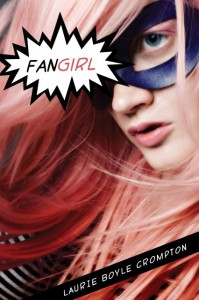
 Laurie Boyle Crompton's book went through a cover and title change, from Fangirl to Blaze (or Love in the Time of Supervillains)! The final, left, reminds me of another one I love (Girl Wonder) but it's also wholly original. From font choices to that great feeling of motion, this is a great package, I think. Here's Laurie to tell its tale:
" Seeing your new book’s cover for the very first time is one of the best parts of this (long!) publishing process. I still remember getting the email from my fabulous editor just a few months after Sourcebooks bought Fangirl. When I opened the attachment the image of a girl wearing a superhero mask with pink hair and the most intense look on her face flashed onto my screen. The girl looked like she was ready to kick some serious butt. It was like no other cover I’d ever seen. I was instantly in love. (Right)
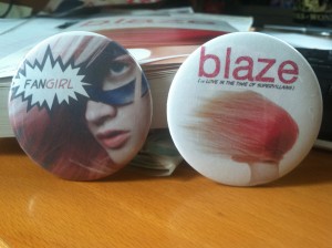
 "I exchanged happy Squee-filled emails with my editor and was given permission to share the cover online. She did caution that it was non-final and said I shouldn't use it for any promotional materials just yet, but honestly, I couldn't imagine that fierce cover getting any better! Once I finished wallpapering the internet with it, I pulled out my old button-maker and got to work making the cutest buttons (left). Oh, how I loved my little Fangirl buttons. Perhaps they will be collector’s items one day because everything about my book changed.
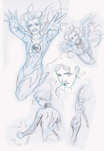
 "The title, the cover, even the release date was pushed back in order to include interior artwork. I’d envisioned artwork from the beginning and so news of all the changes brought mixed emotions. Excited for the artwork, but mourning my beloved kick-butt cover. (See artwork on right by artist Anne Cain: ©2012 Anne Cain.)
"The design team wanted to move away from the comic niche of the original cover and title. While writing the book I worked hard to make it accessible to those who don’t speak comic geek so I agreed it would be a shame if nobody outside the comic realm ever opened the book. I had to trust that Sourcebooks would come up with yet another amazing cover. And boy did they!
"My new cover is just brilliant. Don’t tell my old cover, but I’m totally gaga for the new one. It still has the hint of comic book influence with the font and subtitle, but I think the overall image has broader appeal. The pure white background sets off the bold image of the model’s windblown hair perfectly. In the book Blaze dyes her hair pink using Kool-Aid and although realistically it might be pinker on the ends I love the way her blowing hair looks just like a pink flame! She is ablaze! And the way her face is hidden fits in so well with her feeling invisible and then later wanting to hide. I couldn't be happier with the way everything turned out and I must say - the new cover actually looks pretty cute on buttons, too!"
Thanks, Laurie! I think I've made my views clear: Great cover! The first one is also cool, but the second one feels more like it bridges the comic geek-real world gap really well.
What do you guys think?