 So you guys know that I loved Claire Zulkey's An Off Year. Totally. And her Cover Story pretty much kicks ass too.
Here goes:
"I had no cover ideas, but I did hope that it was a little off the beaten path in some way but I didn't know how.  My favorite YA book of all time, Celine, has an illustration of the narrator on the cover created the author but I don't think that was the path for my book (also I can't draw anything but boxes and horses). At one conversation I told my editor, 'This idea might suck but how about the dri-erase board that you see in the very first scene of the book?' and she said 'Hold on a second' and sent me an email she had already drafted proposing the exact same thing, so I felt bad suggesting that that idea might suck somehow.
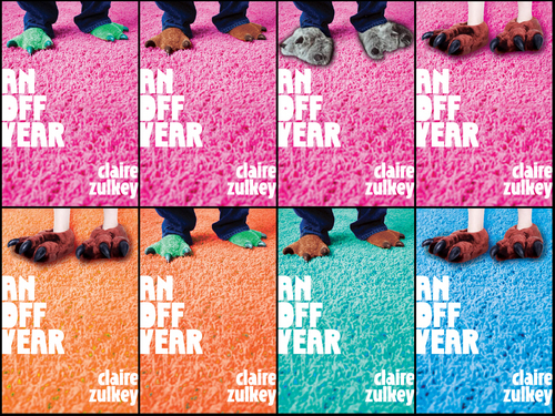
 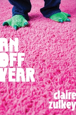 But then a little while later I received the following email from her about the early version that you see here with the lizard feet:
"'Here are the things that will strike you instantly: * this is not the idea we talked about * there is no description in the manuscript matching this image
"'BUT -- it feels perfect to me, I have to say. The 'slippers' you're seeing here are a found image/placeholder and the goal would be to get the same legs/vantage point and the same color contrast but something instantly recognizable as funny bedroom slippers, not like a costume. And I think it would be simple enough to mention the slippers. Same goes for the pink shag . . . which is unexpected but it very visually striking and has the right feel to me. I think it hits the audience you're looking for -- comfortably 20-something crossover.'
"She really sold it and it definitely was off the beaten path, as I had hoped for! My editor wasn't sold on the dragon feet (which I kind of loved--the contrast between these lizard slippers and the pink carpet) so I went searching online for funny slippers. It was a pretty fun task:
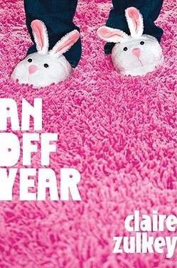
"I always loved the dragon feet but Julie (my editor) told me the art department went berserk for the bunny as you see it and I thought, 'OK they've been doing this longer than I have--they know what they're talking about!' and it worked out great.
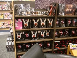 "Truly at first I couldn't believe how PINK it was, since I don't think it's a very 'pink' book--it's about a girl, but it's not a very girly book. But I grew to love it especially since the font I think is a little off-kilter which shows that it's not a super feminine book, plus when I go to bookstores and subtly stick it up next to copies of Twilight (see photo) it really pops!
"Here was my editor's email on the lizard/bunny debate: 'Everyone loved the direction and the contrast but sales had concerns about the ambiguity of the dragon/dino slippers we originally comped (even though they thought it was cute). The requested a more immediately recognizable slipper--and so we have arrived back at bunnies. I do quite like these, because while they are wholly traditional bunny slippers, they are also a little silly and fun. Sales and marketing saw this morning and were very happy with it.'
"If they were 'very happy' with it then so was I.
"The cover didn't change much: my original mockup is almost exactly the way you see it except for the slippers (the lizard version was just a proposed comp, since Dutton never purchased the rights to use that image, which was a stock photo.) And John Green's blurb on the cover too was a late edition I'm quite happy about.
"I believe it was a model on the cover because apparently the art director now owns a gigantic pink shag rug.
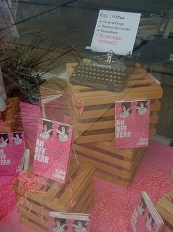 "I love my cover--I think it's eye-catching and fun. I went to a signing at River Lights 2nd Edition in Dubuque and the owner had done a lot of cute stuff to welcome me like put out pink cupcakes and gave me some pink flowers so the undercover girly side of me was very touched by all that. I would like to tell guys that if you take the jacket off it's just a white book with (metallic!) pink writing on the spine so it won't look as feminine although being freaked out by the color pink is so lame anyway."
I love this story. I triple-love the mockups with all the slippers! I also adore Claire's Twilight antics. And yes, the book is hilarious.
In the end, I think sales & marketing were right to go pink-carpet-with-bunnies. What do you guys think?
Also, this is definitely a non-pink book in content, whatever that means. Kinda like another very pink-covered book I admired this year: Natalie Standiford's How to Say Goodbye in Robot.
