 The cover of Elana K. Arnold's Burning arrested me instantly. I love sunlight play like this, and the dusty, western feel of it just threw me straight into dreamland. So I asked Elana how it came about. Here she is to share the story:
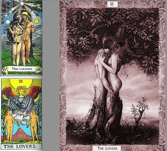
"The Lovers card in Tarot plays an important role in the book, and I thought a piece of art inspired by it would be lovely. In my vision, the cover would feature a large tree, and underneath would be a dark-haired young woman with a blond young man, both naked, holding hands. But my editor told me we couldn't have naked people on the front of a young adult novel. Go figure! Here are a few Lovers cards I like:
"When I saw the cover of BURNING, my first thought was, 'That girl is WAY skinnier than Lala White.' Lala is dark haired, and voluptuous, and the girl on the cover is thin-hipped and kind of a blondish brunette. But I loved everything about the composition of the photograph--the sunspot obscuring the model's face, the colors, the washed-out road, the girl's foot front and center. She's on her way, that one. And I love what the book's designer, Stephanie Moss, did with the fonts and color choices. Really, the whole thing is so lovely.
"I was so excited when I found out that Random House hired a photographer to take the picture that became BURNING's cover. I immediately found the artist's page online and flipped excitedly through her shots. Her name is Eva Kolenko. I also friended her on Facebook and have enjoyed watching her posts about other projects she's involved with--photo shoots and her baby girl!
 "Also, a very strange thing happened a couple of weeks ago. I was visiting Berkeley to help out with their Teen Writer's Camp, and my friend Erica and I stopped in at a bagel shop for breakfast. There, I saw a baby who looked familiar. I asked the baby's mother what the little girl's name was. She said, 'Parker.' Suddenly, I felt like I'd fallen into a parallel dimension. I said, 'Are you Eva?' Yes, she was. I said, 'You're the photographer who shot the cover for my novel BURNING.' Such a strange, small world, full of coincidences, made even smaller by modern social media. Here's a picture of me and Eva (right).
"I love the photo and the fonts of the cover. The letters in the title--BURNING--remind me of sticks ready to be set on fire. The girl, though considerably thinner than Lala, embodies the essence of her spirt, and the sprit of the book--a desire to break free, to hit the road."
Thanks, Elana! What do you guys think of this cover?
