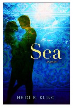
 Heidi R. Kling's debut novel, Sea, comes out next month. It's the story of a girl named Sienna (Sea) who travels to Indonesia after the tsunami with her psychiatrist father's relief team. See more about the book in the trailer below.For now, let's get to the story behind that cover. Here's Heidi:
"I'm one of the lucky ones and my editor did ask my input on the cover for SEA. I suggested an under water image or a young couple riding a motorcycle or motor, as they say in Indonesia. The under water image I came up with was that famous shot of a sea turtle taken from below... I thought that would look cool because so much of the theme in SEA is about being underwater both literally and metaphorically.
"My editor, Stacey, took my suggestions to heart and let the design team know. They liked the underwater concept but wanted something more romantic than the turtle, which made perfect sense to me. They created some mocks, which Stacey then showed me. There were three beautiful images. Two were couples silhouetted in an embrace, and one was a couple holding hands. My first choice, Stacey's and the design teams was the image you see on SEA now. It was a win-win all around.
"I believe all the images are from stock photos and I love what they did with the color. How the yellows, greens and purples are swirling around in the water image, and how the layering effect of the pattern really brings out the color. Initially, the title font was more standard fare, and I love the upgrade to the more exotic air-brush font. The choice of yellow for the title and orange 'A novel,' play a significant part in the story as well.
"As you can probably tell, I'm so pleased with my cover! I think it's an evocative image that is so true to the story. I'm so thankful to the art design team at Putnam and glad SEA's future readers like it too. :)"
Thanks, Heidi! I am a big fan of water covers. This one has such great layers of light, and the pattern that's woven in gives it extra depth. It reminds me a little of Aimee Friedman's Sea Change (probably just because of the water and the colors). Such a dreamy feel.
What do you guys think?
PS-The original title font is here on a book trailer Kepler's Books so made for SEA (I agree with Heidi that the final font is more fun and elegant). Check it out and learn more about the book here:
heidi r- kling