janet lee carey

Cover Stories: In the Time of Dragon Moon

Janet Lee Carey's new book, In the Time of Dragon Moon, has a tagline that is irresistible: Beware the dark moon time when love and murder intertwine. Hello! Sold. She's here to tell the tale of her latest cover (my favorite part is a the glorious sunspot at the top!):

"Early on I thought the cover would show a dragon circling an eerie full moon. The trouble with that image is, it simply repeats the title and doesn’t show conflict or, more importantly the central characters. (Excellent example of why I was meant to be a writer and not a cover designer!)

"My editor, Kathy Dawson, was kind enough to ask for my ideas. Early on we both agreed we wanted a dragon on the cover, something that alluded to the powerful dragon on the cover of book 1 in the Wilde Island series (see all three covers above).

"I also sent Kathy a few photos of what I imagined Uma to look like. She’s half English half Euit, so I found some beautiful images of mixed raced girls. Kathy kept the photos and also asked me to describe Jackrun’s arm scales in detail. (More about that later).

"I knew my publisher had been working hard, trying and rejecting a number of cover ideas to get just the right strong fantasy feel for the book, so I was excited to see what the talented artist, Tony Sahara, had finally come up with. When I opened the attachment, I was thrilled! 

"My editor and I asked for a few small things, mostly color tone changes. And I requested a few changes to the dragon to make him appear more powerful and a little more menacing. Tony Sahara did a brilliant job with the changes.  

"I also noticed the dragon scales on Jackrun’s arm were not like the small scalloped scales I’d described in the book. Tony drew them larger and slightly more diamond shaped. Tony’s were masculine and powerful and it didn’t take long for me to realize I liked his version better. So instead of requesting artwork changes, I went back to the manuscript, used Find/Replace and changed the sections describing Jackrun’s arm scales to match the ones on the cover. Voila!

"The artist did a brilliant job of capturing the tension between Uma and Jackrun. Magic brings them together. Murder tears them apart. At first they don’t agree about who’s behind the crimes. Later they argue over whether Uma should stay on serving the queen at Pendragon Castle or make a run for it. Knowing Uma’s life’s in danger, Jackrun wants her to run. Uma has other ideas. Both are strong-willed and stubborn – the kind of people dragons like. 'For battle is dragon’s bread.' (pg 41)

"I was also happy to see Uma in her green gown. This gown has a lot of significance in her character arc as she leaves a past of dressing like a boy behind and begins to claim her womanhood."

Thanks, Janet! Read more about the book below and watch the trailer too.

About the Book:
            All Uma wants is to become a healer like her father and be accepted by her tribe. But when the mad queen abducts her and takes her north, Uma’s told she must use her healing skills to cure the infertile queen by Dragon Moon, or be burned at the stake. Uma soon learns the queen isn’t the only danger she’s up against. A hidden killer out for royal blood slays the royal heir. The murder is made to look like an accident, but Uma, and the king’s nephew Jackrun, sense the darker truth. Together, they must use their combined powers to outwit a secret plot to overthrow the Pendragon throne. But are they strong enough to overcome a murderer aided by prophecy and cloaked in magic? 


Cover Stories: Dragonswood

Janet Lee Carey has been here before to talk about her cover for Stealing Death. Now she's back with a stunning new novel, Dragonswood. Here's her Cover Story:

"My cover ideas changed as I was writing Dragonswood. I often have a movie going in my head as I’m writing, so every once in a while I’d stop the movie to a still shot and think, 'Hey that would make a great cover.' Some images had to do with Tess’s fire-sight. I envisioned Tess staring into the fire entranced by the vision of a man swinging his sword, or of a fairy woman riding dragonback in the golden flames.

"I tossed a few ideas around with my editor, Kathy Dawson, at Dial Books for Young Readers. Along with the fire-sight images, we discussed a cover related to the early action scenes showing Tess and her friends’ escape from the witch hunter disguised as lepers. I pictured a bedraggled and muddy Tess dressed in a dark-hooded leper’s robe. Much later Kathy Dawson and I discussed the kind of medieval gown Tess would wear -- the colors, the fabric -- by then I realized we weren’t going with the fire-sight or the leper’s robe idea. I didn’t mind Tess wearing a gown since she does later in the book; still I remember asking, 'Will Tess have a knife in her hand?' Kathy paused a moment, then said, 'I think you will be surprised by the direction this cover is going in, Janet.'

"When I saw the cover, I was stunned by its beauty. I remember my hands began to tingle. It was so completely different from anything I’d had in mind, and at the same time, so surreal and gorgeous. I loved the contrast of light and dark, the iridescent title, the bright water and gown against the dark forest, looming clouds, and the surrounding dragon scales. The designers took a complete U turn from where I was going with the cover. They formed a fresh idea evoking the heart of the story that takes Tess from bondage to liberty. The leap on the cover expresses her triumph.

"We talked a bit about changing the gown color, but ended up going with the original white. Really I was so happy with what I saw; I didn’t want to mess with it.

"Have you ever had a flying dream? The Dragonswood cover reminds me of my favorite kind of flying dream where I’m dancing in the sky; doing pirouettes, leaps, and flips, moving fluidly using the pressure of the thermals around me. It’s a truly magical dream and I always wake up from it feeling joyful.

"The cover also helped me discover a concise description of the novel – something I often find frustratingly hard to do. After staring at the book in my hands a long while I thought. One Girl. Bound By Fate. Breaks Free. Those words show up in a number of places now and became integral to designing our Dragonswood Book Trailer. (By the way that’s my voice in the background and my husband strumming the Turkish saz.)"

Thanks, Janet! There has been a lot of talk about there being many Girls in Gowns on covers this year, but I think Dragonswood stands out with movement and a sense of purpose. Plus, the sweetness of the gown makes it seem lie more than pure show. Also, the scales on the edge of the book add a nice texture and evocation. Thoughts?

Cover Stories: Stealing Death by Janet Lee Carey (+ Giveaway!)

stealingdeathfinal large.jpgJanet Lee Carey's Stealing Death is newly out in paperback! In a starred review, School Library Journal called the book "fantasy at its best--original, beautiful, amazing, and deeply moving." (And you have a chance to win it!)Here's Janet to talk about the two different covers:

"I had some ideas for the STEALING DEATH hardback (left); Kipp standing in front of his burning house with his arms out to prevent the Death Catcher from taking his family, or just a hand stealing a black sack (the Death Catcher's soul sack). I'm glad now the artists didn't go with either of those images. Both the HB and the PB covers focused on the characters and the ghost mare, ChChka, Kipp steals to make his getaway.

"The artists for the HB and the PB wanted to capture the right Zolyan clothing for Kipp who starts the story as a farm laborer, and for Zalika who goes from a high class landlord's daughter to escaped prisoner in nomadic dress.

"When queried about their clothing for the PB, I sent links like this one Ethiopian Women focusing on the pics with more traditional dress from the site.

"The Zolyan landscape was modeled on the arid climate in Sub-Saharan Africa. I looked to the more traditional clothing in pics of men and women living in drought conditions. Images speak. The desperate living conditions I saw in the photos spurred me on to get involved with PlayPumps now a part of Water For People. I also challenged readers to get involved on the 'giving back' page on my website.

"My first response to the HB cover = Magical! The night flight on ChChka captured the adventurous aspect of novel, as well as the romance between Kipp and Zalika. It didn't evoke the darker elements of the novel. Later feedback said the image appealed more to younger teens than older teens.

stealing_death_paperback.jpg"First response to the PB (right) = Riveting! The paperback cover heightens the sense of danger that drives the novel. I think it will appeal to readers who are ready to take Kipp's perilous journey that unmasks our old cultural taboos about death. We all see violence and death plastered across the media. We grow up consuming this stuff. What if we stop camera, zoom in the shot. STEALING DEATH isn't about easy answers. It is about looking at death and not turning our backs.

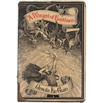
"I was thrilled to see Zalika on both covers. Publishing has come a long way since Ursula K. Le Guin's The Wizard of Earthsea came out. Ursula fought for years to get different ethnicities on her Earthsea series covers. wizard.jpgThe main characters in her Earthsea books are brown skinned. She found it very frustrating that the covers didn't reflect this (left).

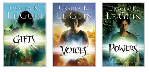
"In a Guardian UK interview Ursula said, 'I see Ged as dark brownish-red, and all the other people in the book (except the Kargs and Serret) as brown or brown-red, to very dark or black (Vetch). In other words, in the Archipelago 'people of color' are the norm, white people are an anomaly... what drives me up the wall is cover illustrators - trying to get them not to make everybody white, white, white.'

"Read the rest of the post . . . I have to say it was not just illustrators who were working within the restricted cultural blindness of their time, but change is afoot and publishing is listening. The covers of Ursula's new YA books are good examples (below). Still we have a long way to go. I enjoyed reading author Elizabeth Bluemle's article on race in children's literature in a recent Publisher's Weekly post.

ursula.jpg "In the end, for my covers, I love the terrifying image of Kipp and Zalika approaching ChChka engulfed in flame. The flaming horse is not burning to death, but alive within the inferno. For me the image evokes the sense of life and death existing together in the eternal now, something essential and mysterious touched on in STEALING DEATH.

"Can we stop death? What would happen if we did? The question took me on Kipp's amazing quest."

Thanks, Janet! I agree that the hardcover is magical, but that it does have a younger-reader feel to it. The paperback cover has a heightened danger to it--and the fire horse is pretty riveting. I'm also glad that the cultures in the book have some place in the covers. Kudos to Egmont.

What do you guys think? One lucky commenter will win a copy of the paperback version of Stealing Death!

PS-Check out Janet's DreamWalks blog here.