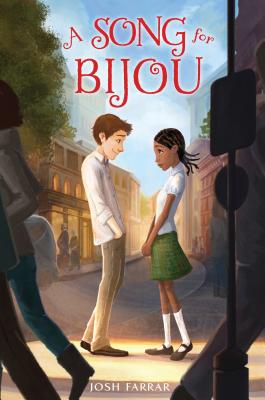
 Josh Farrar's latest novel, a Middle Grade called A Song for Bijou, has a lovely cover that conveys a lot in one image. Here's Josh to talk about how it came to be:
"A Song for Bijou is a multicultural middle-grade romance, so I knew I wanted Alex and Bijou, the protagonists who share narrator duties in the story, to each be featured prominently.
"I was consulted throughout the process. I didn't have super-specific images of the characters in mind - except for Bijou's hairstyle, which is described in detail in the opening paragraphs of Bijou, but I wanted them to likeable, approachable, and no more sophisticated than their tween selves would be in real life.
"It took us a couple of tries to get there - the designer tried a couple iterations of a collage concept, but we didn't get any traction with it - but I absolutely loved the final version!
"As with most writers, my contract grants what is called 'cover consultation,' which means that editorial and marketing are encouraged to seek my input and to hear me out. (This is opposed to the much rarer 'cover approval,' which means that the author has to approve of the final version 100%.) My editor at Bloomsbury, Mary Kate Castellani, went to great lengths to include me in the design process. I have no idea how I compare to other authors in terms of the amount of input I give, but I love illustration and design, and it's fun to be involved in making those decisions.
"I wouldn't say that every single one of my suggestions was implemented, but that I was definitely treated with respect as a collaborator throughout the process, and the fact that I was but one of several people offering input was absolutely a good thing for the cover design. Whereas I've written just two books, my editor and designer have worked on dozens. They know what works, and what doesn't.
 "The cover began as a photo collage, and ended as an illustration somewhat influenced by the poster for the film, Moonrise Kingdom. When the second iteration of the photo collage failed to excite the overall team, we all kind of converged on the idea that an illustration was the next logical direction. My editor sent me examples of several illustrators whose work they thought was good, and I picked 2-3 of those as favorites.
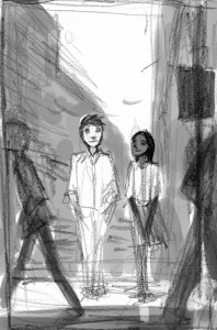
"One of them, Erin McGuire, nailed the cover concept on the first try. In fact, the very first drawing she submitted (right) was quite close to final illustration. She understood instinctively what she needed to do.
"If a book has a plot of any originality, finding the perfect stock photo is like searching for the needle in the proverbial haystack. My first book, Rules to Rock By, was about a 12-year-old, half-Dominican girl in Providence, RI who plays the bass and wants to start a band. Try finding a 12-year-old, half-Latina girl playing a bass! It's not easy, and the initial cover-design attempts weren't cutting it. I was thrilled when my editor gave me the go-ahead to find my own model and photographer. My wife, Tayef, and I were already involved in shooting a book trailer for Rules, so we had a photographer come in and shoot a bunch of stills of the actress who played Annabelle, the main character. The people at Bloomsbury loved the photos, reimbursed the photographer, and used their favorite for the final book design.
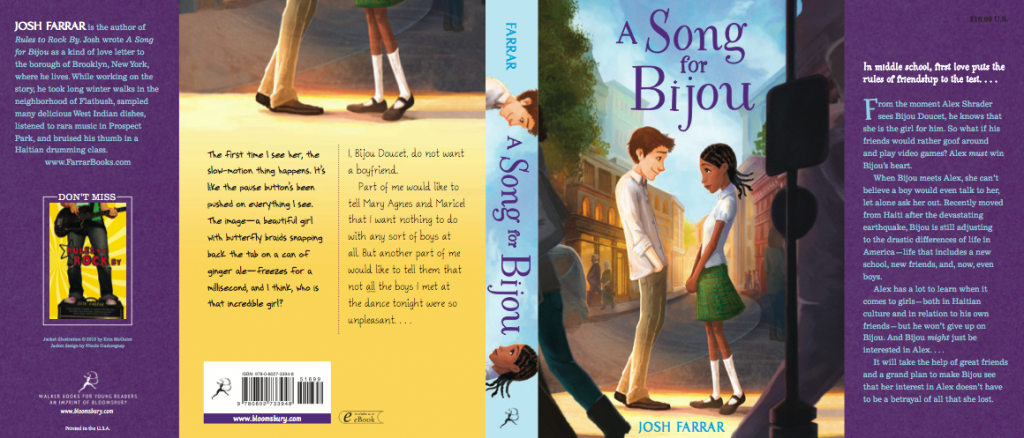
"Not until I actually saw the cover on the final, bound book (above) did I realize how nicely the cover design complemented the novel. A Song for Bijou's narration is split between Alex and Bijou, the two characters depicted on the cover, and the designer did a very nice job of re-purposing the main illustration twice to reinforce the relationship between the cover art and the story told inside. On the back cover, the same illustration is shown, but only from the waist down. And below each character's feet is a sample of the prose written from each character's point of view. Finally, the spine of the cover shows only each character's face, virtually gazing at one another from across the divide of the title. I thought this was a sweet visual metaphor for the distance Alex and Bijou must travel in order to find one another."
Thanks, Josh! I love the colors on this jacket, and the emotion between the characters is spot-on. What do you guys think?
