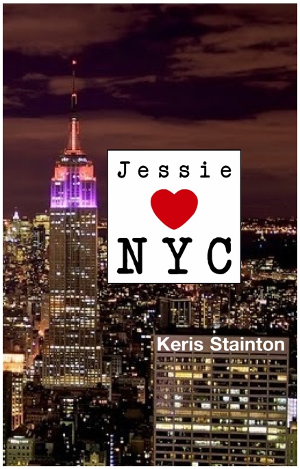
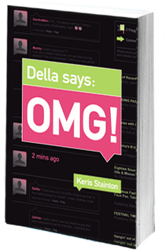
 Keris Stainton was here last year to share the Cover Story for Della Says: OMG!, and now she's back with the tale of Jessie ♥ NYC!
Here's Keris:
"I didn't really think about the cover when I was writing the book -- I'd made a collage so I just pictured that... although it did have the Empire State Building smack bang in the middle!
"After I'd delivered the book I actually dreamed the cover and the title. I told my editor and she asked me to send over the details, so I made a few mock-ups and she loved them (one is below):
 "The first version I saw was black and white (right) and then the next one was gold, but not as fabulously shiny as the finished product.
"When I saw the cover, I absolutely loved it. I think I may have welled up and I know I got butterflies. It took the 'concept' from my dream and made it absolutely gorgeous. And my name on a New York street sign? How could I not love that?!
"The only change I suggested was to add the antenna to the top of the building, and they did!
 "I don't think I could love the cover more. I love the front and the back and the spine and the debossed gold windows. It's perfect. And, yes, it's perfect for the book too, I think -- the Empire State Building is central to the story so I think it's right that it's on the cover."
Thanks, Keris! There she is holding the actual book and showing off the super shine, which is perfect for the streets of Manhattan!
What do you guys think?


![Dellasays[2]-1.jpg](http://static.squarespace.com/static/53482f88e4b0b891fcd5a71e/5350081be4b048f0b406808a/5350135ce4b048f0b408d612/1397756764404/Dellasays%5B2%5D-1-thumb-200x305-1726.jpg?format=original)
