"My father disappeared on a Tuesday that should’ve been like any Tuesday, but eventually became the Tuesday my father disappeared.”
Kristen-Paige Madonia's second novel, Invisible Fault Lines, is set in San Francisco and tells the story of Callie Pace, a 17-year-old girl whose father goes to work one morning and doesn’t come home. It has a pretty unique cover, and the author is here to share the story of how it came to be:
"The novel started with my interest in exploring loss, but not the traditional kind of loss, not death or love lost, but ambiguous loss –- when a person disappears and you’re grieving something that has been taken away, but you’re also navigating unanswered questions. Callie is constantly wrestling with the not-knowing, and that was interesting to me. I believe there’s hope in the unknown just as much as there is heartache, and I wanted to explore that dynamic.
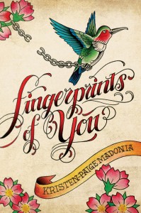
"Because the novel is based around those kinds of themes, I’d always imagined the cover would be a bit bleak to reflect Callie’s struggles with the disappearance of her father. Music, photography and the 1906 San Francisco Earthquake also play large parts in the book though, so I thought the cover might relate to one of those elements. When my publisher and I talked about the design, I only had two requests — the same two requests I gave them with my first novel, Fingerprints of You: no real people, and, in terms of color schemes, I asked them to shy away from pink.
"The first request, no real people, stems from my belief that, as a reader, imagining the characters is part of the process of making the book yours; it’s part of the fun. If the cover shows you exactly what the characters look like, than the reader loses the opportunity to participate in the novel in that way, to make the characters their own. And in terms of the color scheme, I personally don’t particularly like the color pink, but I also wanted to make sure we weren’t limiting our audience in any way. This book will appeal to all genders, and my hope was that they would create a cover that reflected that.
"The image is so different, so unlike any other cover I’ve seen, so my first reaction was gratitude that they took the time to create something unique. A lot of YA covers look fairly similar, so I was thrilled that this one is so different. Because, in a way, the book works as a hybrid contemporary/historical novel, and because 1906 earthquake plays such a large part in the story, I half expected them to use a historical photo or to create a split-screen image that included a contemporary image and one from the past, so I was really surprised the first time I saw the cover art.
"The last place that Callie’s father is seen is the construction site where he works, but it never crossed my mind to use that setting for the cover. But this image, the construction site and the graffiti and the posters, well it’s gritty and grounded in setting, which is a perfect fit for the story. I loved the way they used the Golden Gate Bridge and the way the posters made me think of both concert flyers but also missing person’s posters. The heart is a subtle implication of hope, and the graffiti font is so distinct. It works on so many levels, and now I can’t imagine the cover any other way.
"I was invited to make suggestions, but to be honest I didn’t have many. In the end, at my suggestion, they muted the pink graffiti color a bit and added some texture to the skyline, which made it feel more realistic.
"After all was said and done, I emailed my art director, Krista Vossen, to track down some background info on the cover. It’s always so interesting to see how it all came together! They actually did a photo-shoot for the cover, so it’s a composite of a number of construction sites that she found in Brooklyn. She designed and printed the posters and tacked them up on the construction-site walls. With the poster design, her intention was to create a hybrid of a missing persons poster and a band snipe as a nod to both Callie's father, and to Callie’s passion for music -- and of course to San Francisco. It had just down-poured before she and her photographer, Jon Pack shot, so everything was drenched, which worked to their advantage as it weathered the posters perfectly. Aesthetically, she didn’t want it to look like a book cover and wanted the design to pull the reader directly into the world of the novel.
"In the end, I think the cover truly reflects the mood of the book. It’s unusual and realistic and mysterious, and I’m so thankful for all the work and thoughtfulness that went into creating the design."
Thanks, K-P! I love that the shoot had such lucky timing, and any cover with such thought behind it wins in my book.
PS-Kristen-Paige Madonia's debut, Fingerprints of You, has a very cool Cover Story too!


