laurie faria stolarz

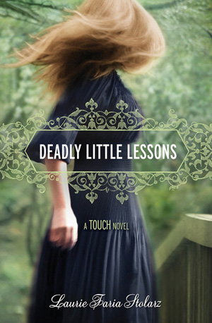
Cover Stories: Deadly Little Lessons

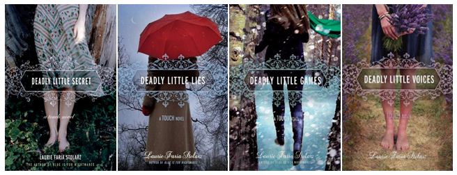
dllessons2Laurie Faria Stolarz has been here to tell the stories behind three of her previous books in the Touch series, and now book 5 is here! The covers all tie together so beautifully, I think. Here's Laurie: "DEADLY LITTLE LESSONS is the fifth book in the TOUCH series, so I already knew the cover would look similar in some way to the others in the series. All of the books feature a young girl, turned away so you can't see her face. They're all dark and mysterious, eluding to the genre of the novel. And there's a romantic quality to the artwork, too. The girl is always dressed in long dresses with wind blowing. Her hair is always tousled. The books are paranormal romance, so I think the covers work really well conveying that."

[See the first four books below]:

the deadlies

"From the first, I loved this cover. As I mentioned, I sort of knew what to expect with the girl featured on the cover, but the colors in this one - the striking emerald green - is just so beautiful to me. I have a feeling it's a stock photo, because I've seen it used on the cover of another book. This is my favorite cover in the series, for sure."

Thanks, Laurie! I love the wispy, faded tones of these covers, and the consistent title treatment is lovely too! What do you guys think?

PS-Contest alert! Enter the Karma Chameleon contest for a chance to win autographed copies of Laurie's books.
Cover Stories: Deadly Little Games by Laurie Faria Stolarz

games cover.jpgLaurie Faria Stolarz shared the story behind Deadly Little Secrets, the first book in her Touch series, and she's back to tell us about the cover of the third book, Deadly Little Games."Since it's the third book in the series, I had an idea of what they might do for the cover. The first two books show a female character (but not her face), in a dark outdoor setting (the woods). Since this book takes place in winter, I knew they'd incorporate snow in some way. I'm happy with the covers to these books. I like how beautiful they look together and the fonts the artist chose. I also like that we don't see Camelia's face. It's more mysterious and it doesn't overly influence how the reader will picture the character. secrets cover.jpg deadly 2 cover.jpg games cover.jpg "I loved the Deadly Little Games cover right away. I haven't found any hidden meanings within the cover of this book, but with the first book in the Touch series (Deadly Little Secrets), the hand of the girl on the cover is slightly illuminated, hinting at the touch power that the characters have." Thanks, Laurie! What I really love about this whole series of cover is the sense of movement they have. Also, I'm a sucker for covers that include weather, and I'm especially feeling the snow right now (there's something sparkling and magical about the flakes, right?)... What do you guys think? PS-Watch the trailer (and enter the contest Laurie's hosting!)

Bonus Cover Stories: Black is for Beginnings by Laurie Faria Stolarz

Laurie Faria Stolarz is on her Girlfriend Cyber Circuit tour this week, and she stopped by to share a short-and-sweet Cover Story:dllm.jpg"I loved the cover for DEADLY LITTLE LIES. I love the pop of red in the umbrella, and I love the barren tree and the sliver of moon in the background. [MW interruption: I love this cover too! I am really into umbrellas for some reason... Also, remember the Cover Story behind Laurie's DEADLY LITTLE SECRET? It's good!] "For BLACK IS FOR BEGINNINGS, seeing my work illustrated, in general, was such a thrill. I loved having the opportunity to work with an illustrator to see my characters come to life. bifbm.jpgMy editor and I viewed the samples of so many different artists as we were picking the illustrator for BLACK IS FOR BEGINNINGS. As soon as I saw Janina Gorrissen's work, I knew she was the perfect person to illustrate my book." Thanks, Laurie! Obviously these books are in different series and they have different feels. Having your characters illustrated must be a thrill (Black is for Beginnings is the first one in the Blue is for Nightmares series that is a graphic novel, which is why it looks so different)! Here are the other four books in that series: blue_redot.JPGwhiteset.jpgsilverset.jpgredset.jpg I see a candle theme... One that they kept in the graphic cover. What do you guys think of the covers?