The lovely Linda Joy Singleton is sharing the Cover Story for the first two books in her Dead Girl... series today! She did such a great job summarizing the stories within her interview that I'll just let her take it away!
Here's Linda:
"I was asked for ideas for the cover and I said that I wanted a shadowy image of a girl with a bright light behind her as she walked away, to represent when my heroine Amber has a near-death experience where she sees her beloved grandmother and childhood dog, but then on the way back from the light she makes a wrong turn into the body of a popular, beautiful, troubled girl.
"Flux/Llewellyn often asks the author for cover suggestions. Then they let the art department and whoever is at their top secret meetings make the decisions (okay, the meetings probably aren't top secret, but as as author who would love to know what really goes on, they always sound mysterious to me).
 "They hired a professional photographer to design a silhouette cover and they also have an art department that works on it, too. When I saw the first version of the cover (left), I thought it was dramatic and I liked the skeleton-ponytail DEAD GIRL logo.
"To be honest, I had hoped for a beautiful cover like TANTALIZE or WICKED LOVELY. I was pleased, though, because this cover was dramatic and what I like to call a 'selling cover' -- meaning it would grab readers' attention in a bookstore. Still the first version was a little too quiet with a silhouette of a cut-out girl with her hands on her hips, looking sort of like a SuperGirl pose. I liked it--didn't love it.
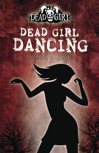
 "Fortunately when they created the cover for DEAD GIRL DANCING, they came up with a different style with more action, showing a silhouette girl dancing with a fiery orange-red background. My (ex) editor Andrew liked this style better, so switched the first cover of the first book to make this design before it went to print (left).
"I'm very glad they came up with the more active design and I'm eager to see what they decide to do with the third book (tentatively titled DEAD GIRL IN LOVE).
 "DEAD GIRL WALKING did have two different versions but that's not normal. Usually I don't see covers until they're ready to go. DEAD GIRL WALKING was the only exception since they changed the cover from the original version -- which really pleased me.
"I like the cover a lot. I think it's mysterious, dramatic and hints at romance, too. But it's DEAD GIRL DANCING, the second book, that has the cover I really, really love. I can't wait for that book to come out in March 2009. It's more mysterious, too, with a stalker, an evil cute guy and spring break wildness."
I really like the final version for the DEAD GIRL WALKING cover, too--having the character look over her shoulder like that brings more energy, I think. Thoughts from you guys?
 Linda Joy Singleton has been here to share her Cover Story for Dead Girl Walking, and she's back to talk about her latest novel, Buried: A Goth Girl Mystery:
"For this cover, I actually thought they would show more of a Goth girl. I wanted something with a girl in dark flowy clothes, netting, piercings combined with a mysterious setting.

