lucienne diver

Cover Stories: Fangtabulous by Lucienne Diver


Fangtabulous
Lucienne Diver has shared her Cover Stories before, most recently the story of Fangtastic. She's back with the story behind the cover of the follow-up to that book: Fangtabulous, of course. "I would never make it as a cover artist!  I see the book like a movie playing out in my head as I’m writing it, but never as a still shot with an iconic image that would perfectly represent the book.

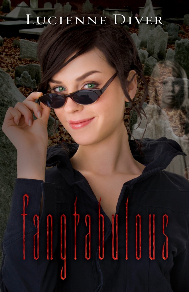
"Flux has always been great about asking for input on my covers.  When asked about Fangtabulous, I said, 'Gina in a graveyard with something ghostly perhaps forming from one of the gravestones would be really wonderful.' I’m pleased to have gotten the little ghost girl that Gina befriends on the cover with her.

"In the first version of the cover, Gina looked more mean girl than mischievous. (Also vapid, which isn’t Gina at all. She may be a fashionista, but not to the exclusion of all else!) Luckily, Flux was great about finding another image with the same model and changing the eye color to suit the character.

"The final version of the Fangtabulous cover is head and shoulders above the previous incarnation! I believe it’s stock photography, though how they got the ghost girl to show on camera... ;-)

"In terms of how I feel about the cover, I’m torn. I was really so taken with the covers for Vamped and Revamped—the unique design, the very striking reds—that I was nervous when Flux took the covers for Fangtastic and Fangtabulous in a new direction. I understood the change—the Vamped and Revamped covers looked like chick-lit, and that wasn’t a big selling point, so they wanted to give the later two books an edgier feel.  I’d love to hear what readers/viewers think."

Read the Cover Stories for Vamped and ReVamped, and see those covers below:

Vamped-thumb-200x308-95 ReVamped-thumb-250x385-1897

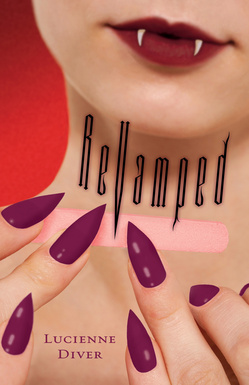
What do you guys think of the original two covers and the new direction? I admit to loving those two first covers--the beauty aspect of lipstick and nails (hi, Lana del Rey!) feels so standout to me. The new ones, though, maybe are more accessible/relatable to readers? Thoughts?
Cover Stories: ReVamped by Lucienne Diver

ReVamped.jpgLucienne Diver is here to share the story behind the second gorgeous cover in her Vamped series (remember the tale behind Vamped?). Here she is: "Flux did such a fantastic job with the cover for my first novel, Vamped, that I wasn't at all worried about what they'd do with ReVamped. When my editor wrote to say they'd come up with the concept of my heroine, Gina, filing her nails to sharp points, I think the only comment I had was to suggest the color of polish. I was sure I couldn't love any cover as much as the first (below right), but apparently, I'm fallible. Who knew?

Vamped.jpg"The first time I saw the ReVamped cover the nail file didn't yet look like a nail file. It was just a preliminary, so I didn't actually love it right away, but after tweaking...it's beauteous! It's a stock photograph that the art department modified. I'm amazed they found something that captured the feel of the book so well. I kind of prostrate myself before the Flux art department in homage.

"I could literally stare at my cover all day. I can't wait to see what they come up for Fangtastic, which is the next book in the series (and Fangtabulous, the one after that)!"

OMG, I'm loving the beauty vibe these covers have -- lipstick, nails, teeth, oh my. What do you guys think of the cover?

Cover Stories: Vamped by Lucienne Diver

The winner of last week's Sarah Dessen contest is... Mishel (who, ironically, has never read a SD book! WHOA.) Start here, M. Send me your address! Today, the fabulous Lucienne Diver is here to talk about the cover of her new release, Vamped. I love that it looks like a Vampire Lipstick ad! Here's Lucienne:

rachelvincent.jpg"I didn't have anything in mind when writing the book. When asked, I took a look at a bunch of YA covers I thought hell_week_rosemary_clementm.jpgworked and sent them off in a file to my editor. It included Rachel Vincent, Rosemary Clement-Moore and Rachel Caine covers. Now that I've seen A.S. King's Dust of 100 Dogs cover, that one would have been there as well.

rachelcaine.jpg "I also put out a call on my blog. There were some fabulous ideas thrown out, and one of my authors e-mailed me separately (I'm a literary agent by day) with a wonderful concept: Have what looks like a photo out of a yearbook that someone has drawn fangs on. It would have captured the fun feel of the book, but might have been a little too cartoonish, ultimately, since Vamped has its dark moments as well as light.

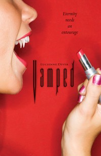
Vamped.jpg"Anyway, I browsed a whole host of YA covers and sent a file of the kind of art I most wanted to emulate. Flux blew them all out of the water. I still think all those covers are great, but Flux managed to truly capture the tone of Vamped with the cover: Fangs and fun!

"I don't know if the girl on the Vamped cover was hired specifically for this photo shoot or whether the art department used a photo from their arsenal which they modified; hard to come by natural fangs, at least in a model that actually shows up on camera!

"I was traveling and first saw the cover when I checked my e-mail at an internet cafe. I paid to print it out and had to show the guy behind the counter, who looked a little bemused. I then proceeded to show everyone I encountered, whether they knew me or not!

"I thought it was pretty much perfect. About the only thing I had to say was, 'Do you want to see my taglines? I promise, they're nothing like my etchings!' Anyway, when he said yes, I sent him off three or four to look at and they chose to go with Eternity needs an entourage, which I love. It now appears in the upper right hand corner of the cover.

"The only changes were the length of the fangs, which they extended to make them stand out more, and the addition of the tagline.

"I really like my cover. My name's a little small (*grin*) but I can live with that. Vamped is all about Gina, my heroine, and she really hates to share credit. After all, I only channeled her. She did all the hard work. (Kicking butt and taking names is hell on her couture.)"

Like I said, I'm all about vampire beauty. I also like that it brings up the red-and-pink question that Sarah Dessen mentioned last week in her Cover Story. And I love the tagline! What do you guys think of this cover?