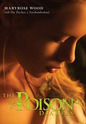
 The Poison Diaries by Maryrose Wood is based on a concept by The Duchess of Northumberland. See? I'm already enchanted. Here's the effervescent Maryrose to talk about that cover:
"[As I was writing], mostly I was thinking about plants. Plants and more plants! But there are already quite a few book covers out there with plants on them. They seem to skew toward spooky tendrils, like the Beautiful Creatures cover, or close-ups of luscious blossoms, like New Moon. I knew The Poison Diaries needed a cover that would appeal to fans of gothic, supernatural and romantic YA, but would also communicate the uniqueness of the poison plant concept. Thank goodness it was not up to me to come up with a solution.
"While writing The Poison Diaries, I read quite a bit about the English Romantic poets. In fact, they’re one reason I chose to set the book in late 18th-century England (that and Wuthering Heights, of course!).
"My boyfriend and I went to see an exhibit of William Blake’s illustrations at the Morgan Library & Museum. There were all these amazing, trippy drawings, with terrifying winged angels and so on. The hallucinogenic feel of it was inspiring to me. (You can check out this exhibition online.)
"I remember sending my editor, Donna Bray, some links to those images. I’m not sure they were useful in her thinking about the cover, but I certainly drew upon some of that imagery when I was writing. People think writing is all about the words, but I find visual research very stimulating when I’m working on a book. Thank you, Google Images.

"There was a day-long photo shoot with photographer Gustavo Marx, a model and tons of props, which I think were mostly vegetative in nature. I wasn’t at the shoot, but both Alessandra Balzer and Donna Bray of Balzer + Bray were there. Apparently the craft services table was to die for.
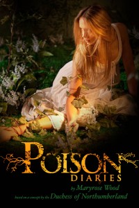
"Before the shoot I was asked my opinion about what sort of dress the model might wear. Imagine! Wardrobe advice from me, who wears the same three tank tops in rotation until winter comes, and then adds a sweater! But we talked a bit about clothing styles of the period. There’s scene in the book where Jessamine puts on a beautiful dress that had been her mother’s. It’s described as having kind of a wedding dress feel. They ended up putting the model in a white dress that has lovely, simple, Regency-style silhouette. Perfect!
"The first, early draft of the cover was a full body shot of the model (right), semi-reclined on the ground and surrounded by greenery, as if she were in a garden. It was beautiful, but upon reflection it was decided that it seemed a bit too pastoral and sweet. The book is edgier and more mysterious than that. It’s about poison, after all! Not Herbal Essence shampoo. Although I do love my Herbal Essence. It’s the smell of my teen years.
"I loved [the final cover] but I was surprised, too, because the first shot I saw had been all about the dress and the props. In the end they used a tight close-up of the (gorgeous) model’s face, and you can barely glimpse what she’s wearing or holding.
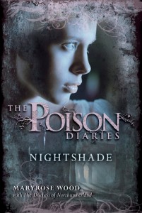
 "But nothing goes to waste. The Poison Diaries was conceived as a trilogy, and different photos from that shoot will be used for the other two covers (see the second cover, for Nightshade, left).
"The penultimate version had a slightly different type placement than the final. I thought was a bit hard to read. I asked them to have another look at it but they were already fixing it. That’s the nice thing about working with creative geniuses! They miss nothing.
"I love the final cover. I think it’s beautiful and mysterious and the poison-green color of the logotype is perfect: natural but slightly unnatural at the same time.
"I also really love the back cover copy and type treatment. The tag line for the book is, 'In the right dose, everything is a poison. Even love.' The idea of love as the ultimate poison is lifted from the book, but to turn it into a nice punchy tagline was genius!
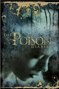
 "I also was tickled to find the UK cover online one day (right). It’s the same photo but with a totally different design treatment. I think this is a neat example of the amazing contribution cover designers make to a book, and how books are packaged differently to appeal to different markets."
Thanks, Maryrose! I love the way nature encroaches on each of these covers, even the very up-close final version. The leaf gives the whole cover a deliciously sinister feel.
What do you guys think?
Check out a past Cover Story from Maryrose Wood, too, because it's full of fairies and magic.
Check out the trailer too: