melissa kantor

Win-It Wednesday: The Darlings in Love

Yes, it's Thursday. This site was blacked out yesterday to protest SOPA (more info here). And now: I'm back! Last week's title, Tempest by Julie Cross, goes to... Keanu lover Natalie! Send me your address, N.

This week, I've got a copy of Melissa Kantor's The Darlings in Love, and she's here to share the Cover Story! Just leave a comment on the cover and you're entered to win a copy. Here's Melissa:

"I had a fantasy of the cover, which might be different from an idea. When I was a kid, there was this book Forever, by Judy Blume. On the cover was a locket with a picture of a girl's face, and when you opened the cover, you saw more of that picture--the girl's whole body, the boy she was standing with, etc. It was this amazing reveal. [That's the cover, right]. Well, since pearl pendants play a big role in the story of the Darlings, I wanted the cover to picture a chain with a pearl on it, and when you opened the cover, you saw that the pearl was actually on a girl's neck and that girl was standing with her two best friends. There's a name for that (a cutaway? something like that). But my editor said that covers like that tend to snag and rip and that's a real problem. As happens with so many things in life, reality intruded on fantasy.

"Once the pearl necklace idea was nixed, I think we discussed there being three of something, to symbolize the thee Darlings. The only thing I didn't want was three cupcakes. There are a lot of cupcake covers out there.

"When I first saw my cover, I hated it. I am not exaggerating. I remember calling my editor and making it clear that I was furious. I was like, This is the worst cover! What were you thinking? I hate this cover, etc. She's a very calm, rational person, and she tried to get me to be specific, so I more or less listed everything about the cover (from the font to the color to the cookies) and said why I hated it. I don't know that that was what she had in mind when she said, 'Be specific.'

"The one thing on the front cover that I was able to change was the cookies. They looked more like amoebas (is that how you spell it?) than hearts. I also had a lot of complaints about the back cover, and they took some of those to heart.

"Okay, this is somewhat embarrassing, but now I LOVE the cover. When I got my copy in the mail, I thought it looked so pretty and shiny. I love the color (which I originally hated) and I love how you can see the skyline in the cookies! I'm completely ashamed of my initial response, though I will say in my own defense that things look very different in real life than in the computer image I saw. If you have a chance to compare this image with the real book, you'll see what I mean.  I think the cookies are great, because Victoria (one of the Darlings) loves to cook and the heart-shapes are perfect because all of the Darlings fall in love in this book."

Thanks, Melissa! I am a huge cookie fan. Sara Zarr's Sweethearts remains one of my favorite covers ever, and this one is crazy cute. Also: I'm hungry. And, by the by, I adore those step-back covers too (I just call them Cover Holes, usually. Very VC Andrews.)

What do you guys think?

PS-Read the Cover Story for the first book in the Darlings series, The Darlings Are Forever.

Win-It Wednesday: The Darlings Are Forever by Melissa Kantor

Last week's winner of Across the Universe by Beth Revis is... Avery! Send me your address, A.book-darlingsLG.jpgYou saw the Cover Story for this book on Monday, yes? Well, now you have a chance to win a copy! To enter to win, just tell me your... um... favorite snack! Yes, your favorite snack. Those Darling girls are picnicking, and that makes me think of... snacks. Mine, currently, is string cheese. Delicious and oh-so-portable. Your turn.

I'll choose a winner at random next week! Good luck.

Cover Stories: The Darlings Are Forever by Melissa Kantor

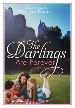
book-darlingsLG.jpgThe lovely Melissa Kantor's latest novel, The Darlings Are Forever, is out this month. She dropped by to talk about that oh-so-Central-Park cover: "I'm not a very visual person, so it's rare for me to have a cover in mind for a book I'm writing. And I'm always amazed when my editor shows me a potential cover. It's like--wow, how'd you think of that? The only cover I ever came up with was the one for The Breakup Bible, right, and that's because it's kind of an inside joke. The Breakup Bible by Melissa Kantor.jpgThe book is named for a really unhelpful advice book that the main character gets, and my book has the same cover as the (imaginary) advice book.

"So I really had no idea what they should do for the cover of The Darlings Are Forever, and I was just as surprised when I saw it as I ever am!

"Hyperion is very nice about asking for input--and I never have any good ideas. I always say something like, 'What about a charm bracelet?' even though I've never written a book with a charm bracelet as an iconic item. And I often suggest a backpack spilling out its contents. Actually, that's my website, now that I think of it--a bag with everything being dumped out of it. I think because it's my worst fear (spilling out all my stuff in public). Hmm, maybe I'm over analyzing here.

"I always hate the covers the first time I see them. Really. Each time, I'm like, UGH! Why did you do that? Then it grows on me.

"I made a bunch of suggestions. I hated the first font for the title, and then I saw the movie Rebecca, and the title for that movie is in a really dramatic font that I absolutely loved. I actually googled a still of the title and then emailed it to my editor:

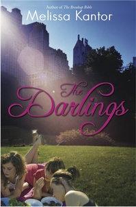
rebecca title.jpg "The basic concept remained what it was from the beginning, but I had a BUNCH of small changes I wanted made, everything from the girls' wardrobes to the way the light fell over the scene to Victoria's hair color. And they were really good about trying to integrate them. Everything big is pretty much the same, but everything small changed. I like the feel of it a lot better now. (See the initial cover, left, and the final cover, right, side by side, below):

darlings_comps_3-4.jpg book-darlingsLG.jpg

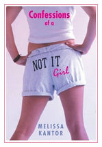
book-confessionsLG.jpg"They did a photo shoot, which I thought was really cool. They did one for my first book (Confessions of a Not It Girl, left) also. It's a picture of a girl's butt (the main character thinks her butt is way too big, and she kind of obsesses about it). The only problem was, at every event I did, someone always asked me if it was my butt on the cover (it's not).

"I've come to really like how the three girls are pictured. It's a moment that feels natural. They're having a picnic in Central Park, and it's such a New York City book and so much of their friendship is talking about their lives while they sit somewhere in Manhattan and eat. So the cover feels very true to the book and the Darlings."

Thanks, Melissa! I really appreciate the tweaks in the girls. You can see all of their faces now and they just look much more book-cover-worthy than the initial draft. Glad the Central Park setting didn't change -- it's gorgeous.

What do you guys think of this cover? PS-You can download Chapter 1 on Melissa's website!

Photo Friday: Teen Author Festival

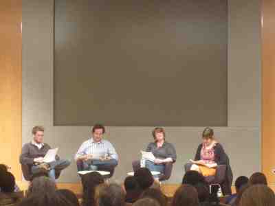
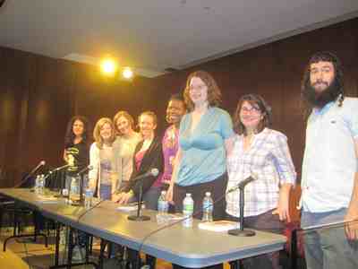
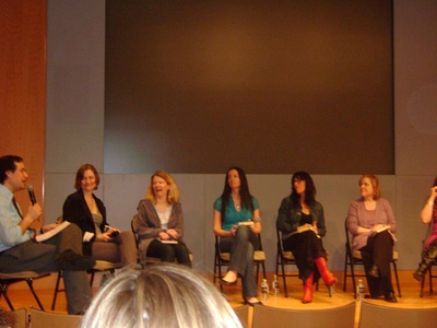
Just a few photos for fun. I missed taking them at Books of Wonder on Sunday (oops!) but here are a few--sorry they're blurry. My blog just does that sometimes.Me with Coe Booth, who's working on Tyrell II (not the official title, but yay! Tyrell is soooo good): IMG_1071.jpg The panel that needs no introduction, but what the heck? John Green, David Levithan, Libba Bray and E. Lockhart rocked their performances of each other's work and then readings from upcoming books. IMG_1076.jpg And my group reading at the Grand Army branch of the Brooklyn Public Library was super great, with an awesome rotating audience of students (L to R we are: Melissa Kantor, Siobhan Vivian, me, Robin Wasserman, Olugbemisola Rhuday-Perkovich, Emily Horner, Adrienne Maria Vrettos and Matthue Roth)! IMG_1077.jpg Ashley, whom I met on Friday during my panel on "The Boy You Can't Have," taped a ton of video that day, so if you want to see some reading clips, check out her youtube channel. She also sent me this lovely photo of the panel. That's David Levithan, me, Elizabeth Scott, Susane Colasanti, Robin Palmer and Maryrose Wood (we just missed Elizabeth Eulberg on the far right!): boypanel.jpg 'Twas a fun week! Y'all come next year, y'hear? More pics (and clearer version of these) up on readergirlz. PS-I also filmed a writing update vlog for Adele from Persnickety Snark -- her new feature asks authors what they're working on, so I talked about Small Town Sinners, my next book, and the one after that! I can't wait to see this feature evolve and hear from other writers. Great idea, Adele!