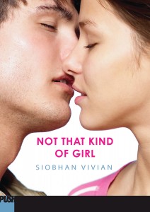
Last week's winners of The Aristobrats include... RivkaBelle, Amanda and Cass! Send me you addresses, ladies! This week I'm giving away my copy of the awesome Not That Kind of Girl by Siobhan Vivian. This book manages to cover school politics, feminism, self doubt, love and lust all in one page-turning package. You will love it!
To enter to win a copy, you can either leave a comment about the cover on the Cover Story or tell me right here what your favorite part of starting a new school year is (or was).
For me, it was the possibility of change. I always wanted the summer makeover, the chance to be a funnier, more outgoing (and okay, prettier) girl in the new year. I don't think I ever got that magic transformation going, but the possibility of it was enough.
Happy Wednesday!
not that kind of girl
Cover Stories: Not That Kind of Girl by Siobhan Vivian
Siobhan Vivian's Not That Kind of Girl is full of heart and hurt and love and kissing and feminism and awesome relationships. It's the perfect, perfect fall read. You will cheer and swoon. I can't say enough good stuff. Now, here's Siobhan with the story behind that hot cover:
"I started out pitching my editor, David Levithan, the idea of two girls standing next to each other, each wearing a private school uniform. One girl would be very buttoned-up and proper, while the other would trick out her uniform to make it look as sexy as possible. But David said that Girl-In-Uniform covers hadn't worked so well for them in the past, so he wanted to go in another direction.
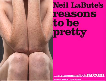
"Then, when I was riding the subway, I saw the poster for the Neil LaBute play, REASONS TO BE PRETTY (right). I loved the vulnerability of that girl, and felt it very much in sync with my main character, Natalie. But I knew I couldn't have a naked girl on the cover, and I wasn't sure if the image would work as well with her in her underwear. Also, it maybe gave off the sense of someone being violated, which was not something I wanted my cover to convey.
"Finally, I came up with the idea of a boy and a girl running into the woods together, as Natalie and Connor spend their nights fooling around on his family's Christmas Tree Farm. Something like this stock photo (left). That idea was shot down, too. I forget why. But I think it did lead us to the cover we have now, a photo that featured the love story of Natalie and Connor, rather than the story of Natalie and her friends.
"I really really appreciated their asking for my input. I got to pick Natalie and Connor from several beautiful girls and very adorable boys. Hardest part of the job. ; )
"I was definitely happy with the cover, but I did worry that it maybe looked a little too romantic. My book certainly has that element to it, but it is also very much about the relationship between three friends. That said, I was really impressed with the emotion captured by the photo. There was tangible heat behind that almost kiss!
"Here's a funny side note: David told me that both of my models were in relationships with other people, and that they REFUSED to actually make out for the shoot, even when the photographer told them to. Hello! What would Tyra say about that?!? I'm actually glad though. I think the second-before-a-make-out is way hotter than seeing actual tongue wrestling.
"The original concept for the photo shoot had been that we'd get a picture of a boy and a girl kissing, and then have the design department put a black censorship bar over their mouths. That was supposed to represent how Natalie fears how people might judge what she does with Connor.
"But when the design department mocked the cover up that way (right), it became clear that the bar covered up all that emotion and longing and tentativeness and romance. It had to go! Nothing could get in the way of that kiss!"
Thanks, Siobhan! I totally agree that the black bar blocks the heat of the cover. So glad it went away. I love the just-before-kiss moment!
What do you guys think?


