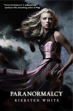
 Kiersten White's Paranormalcy has a gorgeous, dark cover with lots of movement. Here she is to tell the story of how it came about:
"I went in knowing that authors don't have much say in covers so I really didn't have anything specific in mind. In fact, my editor asked me for ideas and I was like, 'Wait, what?? I have no ideas!' I didn't want to get attached to an image and then be disappointed in what ended up being used.
"That being said, I did have several things I didn't want. My greatest fear was that the cover would be hot pink and feature a headless torso.
"The one idea I had was two arms crossing the cover and holding hands in the middle--one glowing slightly, and one a nearly invisible outline, to represent the two main characters. I'm really, really glad they didn't listen to that. I also suggested a hand rising out of a grave and a pink booted foot standing on it, but it was way too Buffy-esque, and I'm again glad they didn't even consider it. At one point they told me they were playing with an extreme close up of eyes, which I liked because eyes are very important in the book.
"All along the way I was really hoping that my cover wouldn't feature a model.
"When I first saw the cover, I freaked out--in a good way. I was shocked that they went so dark and dramatic with it, but I was so, so pleased. I was worried because of the humorous tone that it would get a very playful treatment that wouldn't be very true to the darker elements of the book. So when I saw their initial concept with the foreboding, dark background and the full model in the foreground I was very surprised and very excited. All of my fears about using a model disappeared because it was such a striking image and felt atypical.
"We got the cover mock-up to get a feel for the design, which we loved, and then they sent it to us again when all of the elements were in place but still being tweaked. We suggested shifting the placement of the thistles in the foreground and softening some of the lines around the model.
"They took our comments to heart. Of course, we didn't suggest anything huge, but we really didn't need to since it was such a jaw-droppingly beautiful image. But they did change the thistles and fix some of the lines.
"They changed her dress to flow directly out instead of swooping down a bit first (and I'll admit I did like the swoop, but the flowing went over better onto the back of the cover), and adjusted some of the smaller elements. But it remained pretty much the same.
"They did a casting call and sent me the photos of the model they picked. I loved her because while she's obviously beautiful, she's also a little unusual looking and has striking eyes, which was important to me. My editor sent me video from the photo shoot, in which the poor model had four huge fans blowing on her and people all around holding her dress out with fishing line! They actually took a whole series of photos of her to use for future books, which was really great (see a shot from the shoot, below). I'm glad they planned ahead so we can have a consistent look. After that they put in the back- and foregrounds and type elements.
 "I think the final cover is a great representation of the book. Some people have complained that it's too dark, but I love the counterbalance of the dark, stormy sky with Evie's white blond hair and shimmering pink dress, because she really is this sort of beacon of hope and humor in a very dark, dangerous landscape. If I could change anything I'd have a hint of smile on her face, but all in all I think it's an incredible cover. And it did end up being an almost exact match to a scene in the book, which was awesome! All in all I feel incredibly fortunate that I ended up with a cover much better than I had imagined or hoped for. I love it! And just wait until you see the sequel's cover..."
Beautiful cover aside, this book sounds seriously good. Have you guys read it yet? What do you think of the cover?
PS-Here's the trailer, which makes me need it NOW.