 Elana Johnson's Possession has great buzz. For example: “Emotion pumps through every scene of this thriller. Given all the urgency and action, the novel’s ending may surprise readers as the heroic adventure turns into a tragic love story.” –School Library Journal
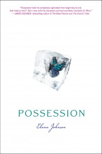
The book also has a simple but captivating cover. Here's Elana to talk about that:
"I didn’t dare dream of a cover. That way, if it wasn’t what I’d pictured, I wouldn’t be disappointed. And luckily, someone much smarter than I am designed my cover—and I love it!
"I got to give input after I saw the design, and something I suggested actually got changed. It was something little about the font on my name, which used to be a much tighter, more Zaner-Bloser, type of cursive. I didn’t like the cursive at all. But my editor explained that cursive is actually used to convey romance in a novel. (Who knew?) They did change the tight tight cursive to a much looser, freer cursive. And I love it.
"Truly, the first thing I thought was, 'Holy crap, I can’t breathe, it’s awesome, and holy crap! It’s white! And that butterfly! I love it!'
"The second and third things weren’t as exciting. But I have always loved my cover."
Thanks, Elana! I didn't know about the cursive-romance link, but it does make sense. I like the whiteness of this cover, and the blue/green.
What do you guys think?