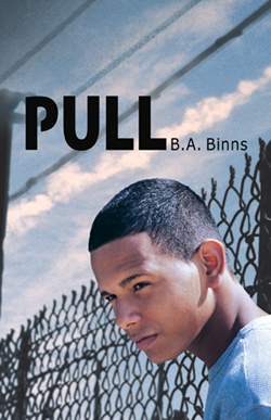
Last week's winner of Five Flavors of Dumb by Antony John is... Zaneta! Send me your address, Z. This week, B.A. Binns is here to talk about the cover of her new release, PULL, and to give one commenter a copy of the book!
Here's B.A.:
"My publisher, WestSide Books, did something many publishers shy away from these days. They not only bought a young adult book featuring an African American couple, they also put a picture of the hero on the cover. Because PULL revolves around the boy, and is told completely from his POV, the decision was made early on that the book would have a teenaged male spotlighted on the cover. They showed me a selection of models. I picked out a picture of a really cute guy with curly hair and a huge smile.
"They picked the David that now dominates the cover of PULL. And when I saw what the art department put together, I realized they had my hero's essence, and by now I feel that is the face of David Albacore. While I wasn't given cover art approval, they did run things past me and my editor assured me that if I really hated things they would make changes. It took me ten seconds to realize I wouldn't change a thing. They had captured the essence of what I wanted potential readers to feel when they see that cover.
"They and I both know the cover is a risk. There is the fear that some young people will turn away from the book just because of the face on the cover. But this book has a universal theme: that we have to make our own choices about our futures, even if others--adults--think we are wrong. David and Yolanda, the heroine, happen to be Black. But mostly, they happen to be teens, and each has something the other needs to survive the traumas in their lives. David narrates the book, we see the world and the girl entirely through his eyes.
"To me, this cover reveals a young man who could be anyone with the weight of the world on his shoulders and life-altering decisions to make. And I hope that teens, both female and male, will take a chance, open that cover, and let the story and his choices speak to them."
Thanks, B.A.! I've been staring at this cover, and it makes me wonder what is going on in David's world. I think it does its job, and I love the colors and the sun on David's face--it almost looks like a movie poster.
I'm also interested to hear what you guys think about the issues that Barbara mentioned--that this cover is a risk. I'm sad about that, but I know she's right. Thoughts on this cover or on the lack of diversity/boys on YA covers in general? One commenter will win a copy of the book, courtesy of B.A.!
PS-Check out the trailer for PULL:
pull