Superawesome Author Laura Resau is here to talk about her newest cover in fascinating detail! Here she is:
 "The Indigo Notebook is the first book in my new travel-adventure-romance series. Each of the three novels is set in a different country (and as in all of my books, there's a bit of mystical/magical stuff in there, too...). As I was writing this book, I imagined the cover being similar to my most recent novel, Red Glass (right, illustrated by Steve Rawlings and designed by Vikki Sheatsley).
The cover of Red Glass takes my breath away. Many people of all ages--both guys and girls--have told me that they were immediately drawn to it. I thought that since each book in this new series is named for a different color--The Indigo Notebook, The Ruby Notebook, and The Jade Notebook--the artist could do some really cool things with color and imagery. For this first book, I imagined a purple-blue light-saturated cover with images of a waterfall, crystals, candles, the Andes, a snake, and a close up of a girl's and guy's interlocked hands. When I told my editor at Delacorte my ideas, she said that they'd already decided on a different designer and cover look because they wanted to set this apart from my other books to signify a new series. This seemed reasonable to me (but I'm still holding out the hope that some future book of mine will have a similar look to Red Glass!)
 "I was excited to find out that Marci Senders, the designer of the infamous Sisterhood of the Traveling Pants covers, would be creating my series covers. The first cover they ran by me (below) was pretty, but it didn't evoke travel in Ecuador (which is where the book is set.)
 "Another problem was that it featured a girl with a a fair complexion holding a fair-skinned guy's hand. In my book the main character, Zeeta, and her love interest both have dark skin and hair (features which are essential to the storyline). I thought the girl's expression was intriguing, but she looked too polished, sitting at the café table in an elegant black outfit. To me, she didn't quite capture the spirit of Zeeta's personality or give the sense of movement and flight in her story. Zeeta has lived all over the world with her whimsical, hippie-ish mother, and her style reflects her upbringing--for example, her wardrobe has come from markets in Southeast Asia and Latin America.
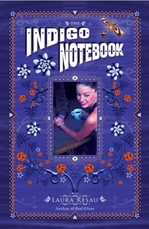
 "My editor was very receptive to my comments, and asked me to send some pictures of how I envisioned Zeeta. I searched through hundreds of stock photos looking for the right match. It was frustrating! I couldn't find the perfect picture, but I settled on one that gave a sense of windswept flight. The girl's skin and hair are still lighter than I wanted, but it was the best I could find. Marci tried out this photo in the cover (left)...
 "I was happier with the second version, and thankful to Delacorte for incorporating my feedback, but part of me still wished for a cover that clearly suggested travel and adventure in the Andes. Luckily, the sales team wasn't crazy about the cover either, and asked for another one.
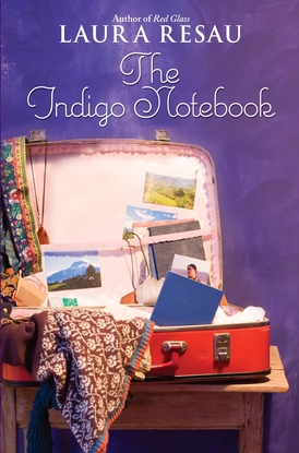
 "In the end, my editor and Marci decided on covers that featured a vintage suitcase filled with things that suggested each book's setting. I was thrilled about the idea--and even more thrilled to hear that they planned on doing a photo shoot of all three covers. Here's the coolest part: they asked me to send them some items to include in the suitcase! The photos tucked in the suitcase are ones I took in Ecuador, including the picture of Zeeta's love interest, Wendell. The guy in the photo is actually my good friend, Maria's, brother (an indigenous Otavaleño Ecuadorian). This is perfect--my character Wendell shares his ethnic heritage (although he was adopted by an American couple when he was a baby). The crystal and the white embroidered shirt are also mine (and the toothpaste happens to be the same brand and flavor I use!).
"I'm very happy with this final cover. It's definitely a book I'd pick up in a bookstore. I love the rich indigo background and the vivid colors and interesting patterns and textures in the suitcase. I hope potential readers find the cover as enticing as I do!"
I love this story and the lengths everyone went to to get it right. Read more about the book, and enter for a chance to win a copy, at readergirlz.
Meantime, what do you guys think of the cover?