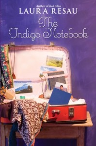
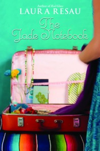
 The lovely Laura Resau has a new book out! The Jade Notebook is the third in her beautiful series about Zeeta (read her Cover Story for The Indigo Notebook). Kirkus Reviews says, "In this third in a series of novels focusing on Zeeta and her wanderlust-stricken mother, readers are immersed in the details of a lovingly described coastal town in Mexico and an action-filled mystery surrounding the poaching of ancient sea turtles that make their home there... a graceful conclusion to Zeeta’s story."
Here's Laura to tell the tale of the cover:
"I'm happy and honored to be back on your blog, Melissa--I could spend all day reading these fascinating cover stories!
"The Jade Notebook is the third and final book in the travel-adventure-themed Notebooks series, each of which is set in a different country. The series went through a few different cover looks over the past few years. If you're curious, you can read the story behind the hardcover look of the first in the series, The Indigo Notebook, here. For that cover, my publisher, Delacorte, did a photo shoot of an open, vintage-style suitcase containing items that evoked each different setting, below. (The Indigo Notebook is set in the Andes of Ecuador, The Ruby Notebook in southern France, and The Jade Notebook in a small Mexican beach town.)


"After the publication of The Indigo Notebook with the suitcase cover (above), Delacorte decided to change the look of the paperback and subsequent books in the series. My understanding is that the influential bookstores pushed for this, believing that a photo of a pretty girl on the cover would increase sales. With the new cover look—back views of a girl with a gorgeous background, right--Delacorte wanted to project a sense of romance and fun in a seductive setting.
"I do think that the new cover look achieves this, but I have to admit, I did appreciate that the suitcase-themed covers clearly evoked the idea of travel, which is central to the series. Still, the backgrounds in the new look do suggest exotic locales. For me, the final cover of The Jade Notebook -- a girl swimming in crystal, blue-green waters – evokes an almost visceral reaction of 'I want to go there!' It's so sensual--I can almost feel the tropical water, taste the salt. he color of the sunlit water feels delicious to me… especially now, in mid-February, when I'm longing for the beach! And I was really happy that they photo-shopped sea turtles in the image, since they're essential to the plot. I also think the font is lovely--eye-catching and whimsical—and suits the story well.
"The only aspects of the final Jade cover that I wasn't happy about were: 1) I wish the girl's skin and hair were darker to more accurately reflect Zeeta's appearance. (In response, Delacorte said they did the best they could using stock photos.) 2) It would've been nice to somehow suggest more mystery, danger, and adventure since there's actually a lot more to the story than sweet romance in a beautiful natural setting.
"Overall, though, I'm happy with the cover, and appreciate the work that the designers went through to come up with appealing images. You can read more about the book here. You can see photos of the setting for the book on my blog, here and here. I’m doing a book give-away this week, so feel free to swing by my blog and enter. Thanks for reading!"
Thanks, Laura! I do think the suitcase covers are charming, but I understand the appeal of the new ones too (see all three, above). They're almost more arresting at first glance, which is really important. (Though I do love the idea of pouring over the original covers and seeing all the little items in the suitcase.)
What do you guys think?
PS-Remember to visit Laura's blog for the giveaway this week.

