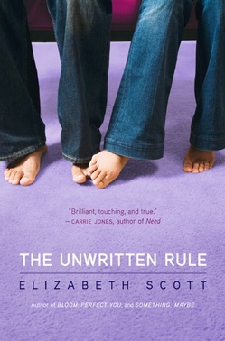
 I read Elizabeth Scott's latest novel in one day last week while I ate gingerbread cookies and drank coffee and tried to avoid my revisions. Total treat! (You can win a copy of it, along with four other great titles, on I Heart Daily--and enter the contest to win Living Dead Girl right here on this blog!) Oh, and check out Adele's review of the book to learn more about the inside.Here's Elizabeth herself to chat about the gorgeous purple cover!
"I didn't really have an idea for the cover. I just knew I wanted it be as pretty as my other Simon Pulse covers are!
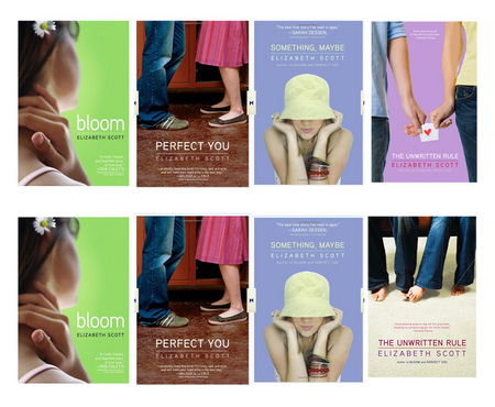
[See two cover tries for The Unwritten Rule in this lineup of Elizabeth's other books (the bottom one is the final, just in different colors):]
 "My editor and I talked about what would look good, and we both thought hands touching or passing a note might be cute. But it turned out that there was a much better picture out there!
"We looked at a lot (A LOT) of images before *the one* was found and we talked about all of them. [See three below!]


 "When I first saw my cover, I thought, 'PERFECT!' And it is. I think it is the cutest cover!
"Simon Pulse has amazing designers, and when I saw the original image that ended up being my cover, I asked about making the background purple because a previous picture I'd seen had a purple background I liked. And they did that, and then we decided the carpet needed to be purple too, just to pull it all together. And the designer did all of that, plus more, and it looks amazing!
"It was a stock photo that the designer tweaked quite a bit--in addition to the color changes, she also did some work with the model's feet and even their jeans!
"I still think it's perfect--I smile every time I see it."
Me too! I do like it the best of all the choices--though the note-passing one is my #2 (maybe with a shorter manicure--those long nails are freaky). What do you guys think?
PS-Don't you love how Elizabeth and Simon Pulse let us share all these test covers?! They did it with Something, Maybe too. FUN.
the unwritten rule