torn

Cover Stories: Torn

Stephanie Guerra's debut novel has a cover that really tells a story, especially when you look at the entire jacket. Here's Stephanie to talk about the process:

"I love the cover of Torn, because by some amazing coincidence, the model looks like the friend on whom Stella, my narrator, is based (see the picture of 'Stella' and me in high school, below right). I also like the model because I can see both Latina and Eastern European characteristics in her face, and Stella is biracial Mexican and Croatian.

"The art department used stock photos, and I’m grateful for the level of input they allowed. While I wasn’t consulted about the original design, I was given seven possible head shots to choose from, and asked for feedback about framing. The whole process was fun, collaborative, and stress-free.

"As far as the design itself (the close-up of Stella on the front is mirrored by one of Ruby on the back--see full jacket below), I feel it's perfect. Torn is about what it means for a woman to be a true friend, and what it sometimes requires from us. There’s a lot of YA romance in the marketplace right now, but when I was a teen, my friendships defined my experience more than my romances did. That comes through in Torn; there are men in both girls’ lives, but ultimately their friendship is deeper and more sustaining than their respective romances. I think the dual head-shots keep the spotlight where it belongs: on the girls.

"While I had choices around Stella’s headshot, the art department only offered one option for Ruby. At first I thought she looked scary (those eyes!), but now that I have the actual book in hand, I see that she was a good, dramatic choice. Ruby's character is fiery, and it makes sense that her image should reflect that intensity. The only quibble I had was that Ruby's red hair is a dye job, while the model is clearly a natural redhead. Not a big deal in the grand scheme of things! By another stroke of luck, I met a young mother at a playground who resembled the Ruby model. I asked the woman if she’d like to act in my trailer, and she agreed (thank you, Michelle!).

"The cover came together fortuitously in so many ways that I feel a sense of peace that it’s just right. I even love the end papers. Maurice Sendak once compared the end papers of a book to the curtains of a theater, and I think it’s a great analogy. My end papers are a delicious, candy pink—not quite bubblegum, not quite cherry blossom. The pigment is rich enough that the color feels strong, but not shocking. Somehow it reflects both the estrogen and the edge of Torn.

"And now I could go on about why I love the type-face… but I have to stop somewhere. I’ll close by saying that as a lifelong book lover, it’s very satisfying to have my first book feel aesthetically right, and I’m grateful to the designers at Marshall Cavendish (now Amazon Publishing) who made it happen. Thank you!"

Thanks, Stephanie! Below are various headshots for Stella, below. I love the final pick! And check out the Torn trailer too. How cool that Stephanie found a real-life Ruby lookalike to use for the filming!

What do you guys think?

Cover Stories: The Cold Awakening Series

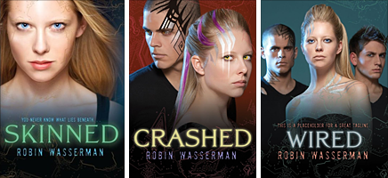
The amazing Robin Wasserman is back to share the story of the cover--and title!--changes for her latest trilogy. Here goes: "The last time I got to pontificate on this blog, I talked about how much I loved the cover my publisher had come up with (true) and how much we’d struggled to come up with the right title for the book (also true), and then ended with this: 'My editor promised me that after a few weeks of looking at SKINNED on the cover, I wouldn’t be able to imagine the book being titled anything else. She was right.'

"As they say…famous last words.

"Because fast forward three years later, and these books are getting brand new covers. And brand new titles to go with them.

"And I couldn’t be happier.

"Not that I didn’t like the original look for the trilogy, but who doesn’t love a makeover? (You’re talking to a girl who spent all of high school convinced that if she whipped off her glasses and shook out her ponytail in just the right way, she might become homecoming queen.) (Didn’t happen.)

"My editor first contacted me about the repackage about a year and a half ago (which means before the third book in the trilogy even came out!), and as I had the first time around, I jumped at the chance to weigh in:

'I'm so excited about the idea for new covers for these books! I'm the first to admit that I'm visually/artistically challenged, to put it mildly, but since you kindly asked if I had any thoughts on the subject, I took a look around to see what jumped out at me, and actually, I found that everything I gravitated toward had a sort of similar look, so I'm sending them along to you, in case anything sparks your imagination. You'd mentioned you were thinking iconic, which I think is a cool idea -- and I'm wondering what you think about using the *body* as a object, so to speak (ie instead of a chair or an apple or whatever), since that really gets at the heart of the trilogy.

I'm not talking about headless girl parts, so much as something like this - or even this.

In a sort of similar vein.

"We were all agreed that we wanted to move away from the photographic look of the original covers and find some kind of object that would really capture the theme of the trilogy. My editor and designer weren’t sure my idea of using the human body would work, so they suggested we try to find objects the evoked the same feel. I loved the way they were approaching it:

"'We’ve been talking a lot about the ideas of frailty v strength, something beautiful masking something unnatural, rebirth, etc—all with an iconic approach.' ---my awesome editor

"They told me they were going to look around from some stock photos of things that might capture this frailty/strength, natural/artificial divide, like cracked eggshells, frozen flowers, and silhouetted fruit.

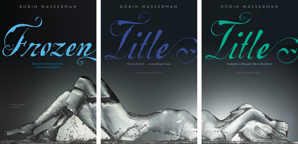
"Which I thought was a great idea…but not as great as the idea they sent over a couple weeks later:

"Apparently the designer came across the image and immediately fell in love – and you can see why! It took about five minutes for everyone to agree that these were perfect.

"Which left us with only one tiny problem… the titles.

"I’ve had a lot of people ask about why these books are getting new titles, and I usually say something like, 'Um…I don’t actually know? Sometimes that just happens? I guess?' So this time it occurred to me that instead of stammering like an idiot, I should just ask my editor. The Official Answer:

“'The original packages seemed to have missed the mark, perhaps because--as some people theorize--Skinned sounds a little horror-ish and Crashed and Wired feel too tech-focused. You were on the cutting edge of the swell of post-apocalyptic/dystopian, before we had a robust category in teen (in fact, we called your trilogy "realistic science fiction" which is still accurate but not currently "in vogue"), and the packaging across the YA industry would ultimately head in a starker, more iconic direction. Hence the change!

"Who knew?

"Of course, there’s a big gap between deciding we needed new titles and actually agreeing on new titles. And lost in that gap is a long, loooooong list of discarded ideas. Here’s just a taste of some of the title brainstorming:

DROWN TRESPASS SACRIFICE BARE EXPOSED DREAMER UNBOUND UNFORGIVEN EMPTY GUILTY FORGOTTEN

"Not to mention the unused trilogy titles! THE METAL DREAMERS SONGS OF STEEL THE LIVES OF LIA SONGS OF SELF

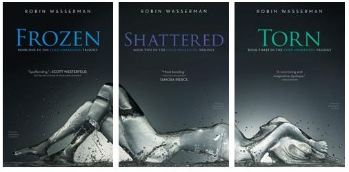
"You can see how this might have gone on forever. It’s kind of a miracle that we finally settled on something, and if you ask me, it’s something perfect:

"This has been a strange experience for me, since the original titles and covers have come to feel like they belong to me, while, for a long time, the new versions felt like they must be someone else’s books. Someone else’s beautiful books, to be sure, but not anything I had the right to call my own. It’s taken a lot of mental gymnastics – and a lot of gazing at the new covers on the computer screen – to convince myself that even with a new look and a new name, these are still my books. But I’m finally there.

"And I’m grateful for it. Because, if you want to know a secret--just between you and me and, you know, the entire internet--I love these covers about a million times more than the originals. I love these covers more than any covers I’ve ever had. Now I just hope the rest of the world will, too."

I love hearing this detailed story. Thanks, Robin! Um, if ever there were a reason to buy all three books in a series (besides the story, of course), these covers are IT. Am I right?

What do you guys think?